BrandCulture has designed wayfinding strategies for some of the busiest hospitals in NSW. Here’s what we’ve learned.
When it comes to wayfinding, the biggest challenge hospitals face is that their visitors often feel sick and anxious. They may be racing to an appointment or rushing to visit a loved one. It’s our role as wayfinding designers to minimise their stress by creating environments that communicate clearly.
We believe hospital wayfinding should be unembellished, clean, pure in its intent and impossible to miss.
What is the primary purpose of hospital wayfinding?
“Hospital wayfinding is ‘wayfinding’ in its purest form because the sole function of signage is to provide directions and assurance in an uncomfortable situation. You can’t risk having people lose their way en route to Emergency,” explains Nick Bannikoff, Design Director at BrandCulture.
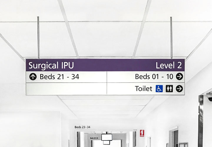
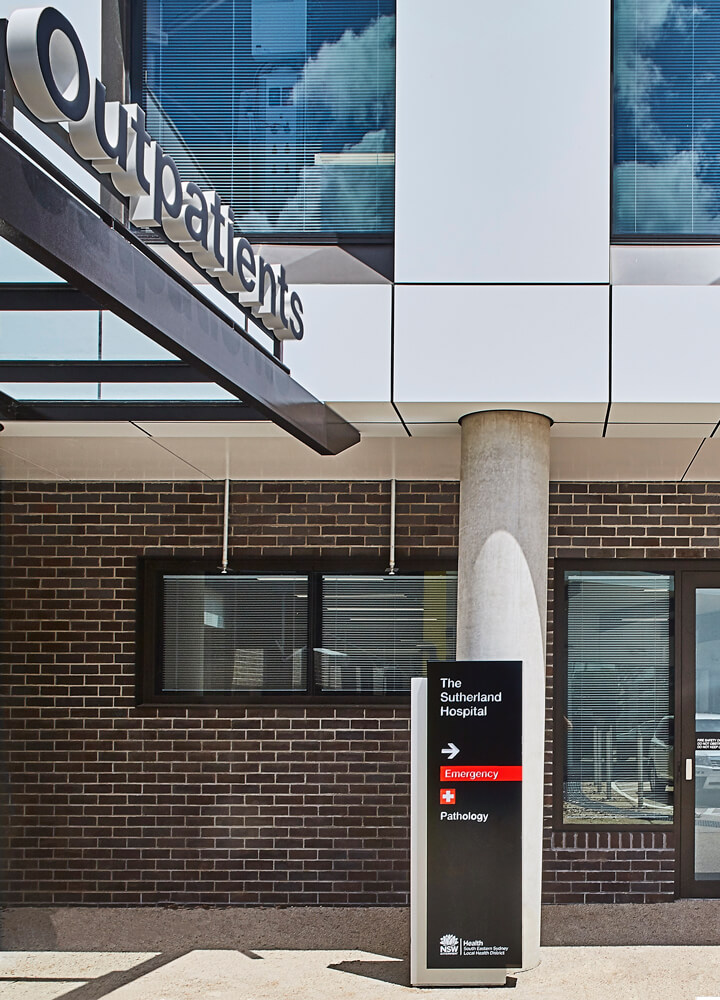
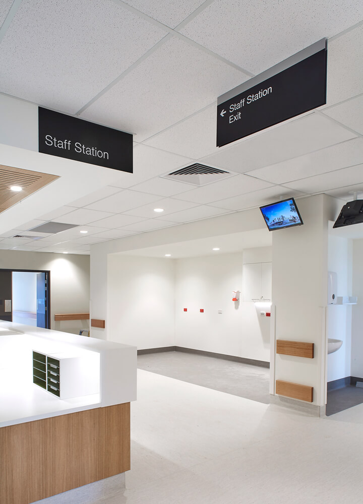
When BrandCulture implemented the wayfinding strategy for a start-of-the-art building at Sutherland Hospital, designed by BVN, we knew the wayfinding system needed to provide absolute clarity to flustered visitors who may not be thinking clearly.
This required extensive user interviews, consulting everyone from the maintenance team to the nursing staff to understand how they move around the hospital. After mapping all sign locations, inside and out, we implemented a suite of identification signage and wall graphics, and relocated the Emergency sign to improve its visibility.
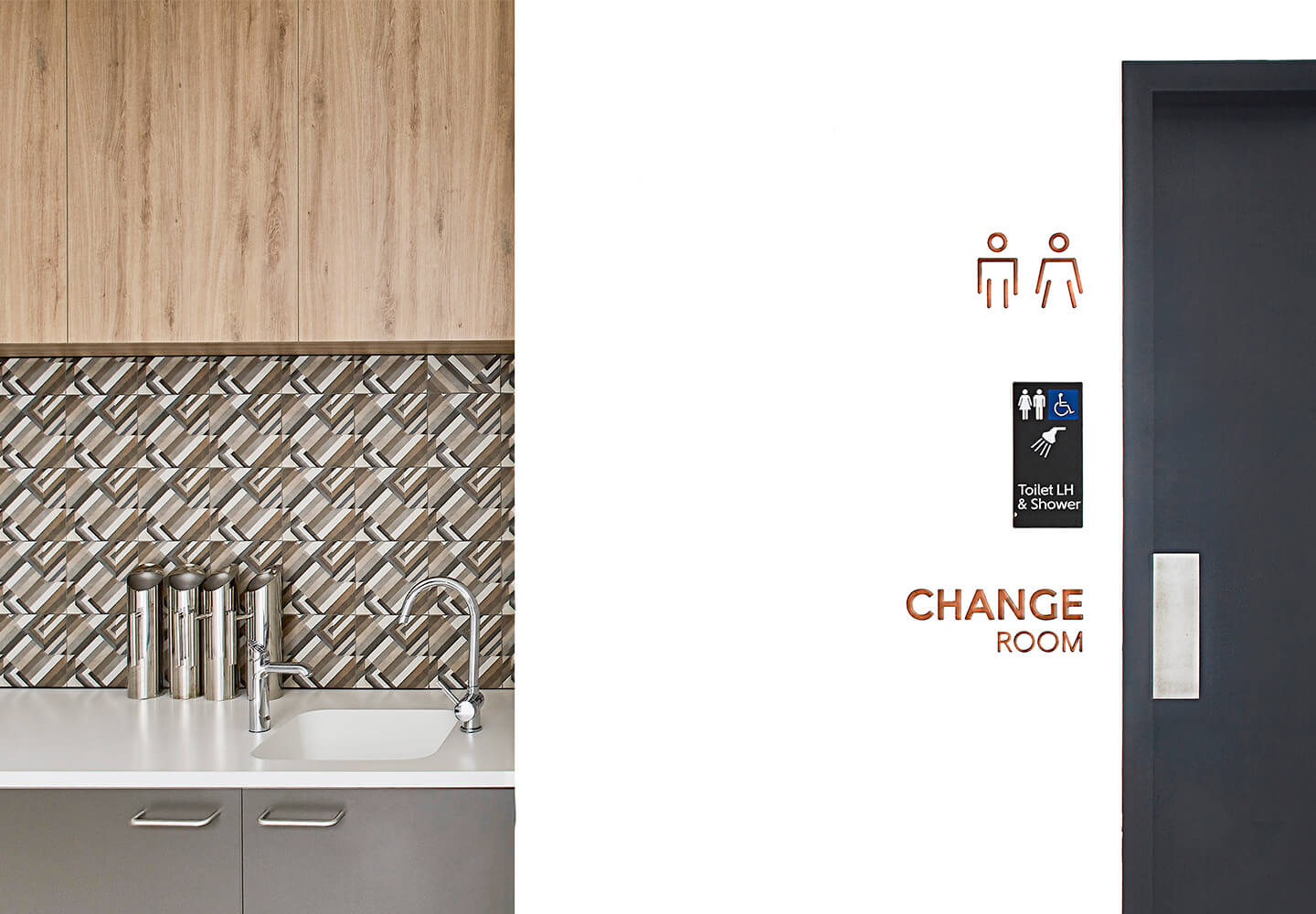
On top of being highly functional, hospital signage should also feel welcoming to people of all ages, cultures and abilities.
At Parkes & Forbes Hospital in central New South Wales, the Lachlan Health Service project team asked BrandCulture to introduce Wiradjuri language into hospital signage to make the traditional custodians of the area feel welcome. We also designed environmental graphics inspired by local flora and fauna and patterned in a way that pays tribute to local indigenous art.
“Experiential graphic design is a great way to make people feel welcome to hospital, and build a sense of local community,” says Nick.
What common issues do hospitals face?
Every day, hospitals welcome a steady stream of first-time visitors. This means a different approach is needed for front-of-house versus back-of-house signage: front-of-house signage needs to be functional and welcoming.
The fact that hospitals are constantly in flux can also increase strain on staff: a nurse racing to surgery doesn’t have time to spare giving directions to lost, worried visitors.
Since 2016, BrandCulture has been working with Dubbo Hospital while it completes a major $150 million redevelopment. We’re extending the hospital’s wayfinding system, designed by Cox Architecture, to new stages of the redevelopment, with architecture by HDR.
One of the biggest challenges from a wayfinding perspective is helping staff and visitors find their way around as entire departments are demolished, constructed or relocated. Our signage designs are playing a vital role in supporting staff to offer business-as-usual.
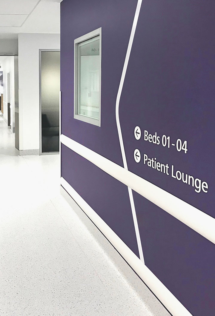
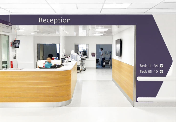
Nick explains our approach: “We’ve established colour-coded regions where each region is associated with its own shade. We are also applying the principle of ‘progressive disclosure’. This is a common wayfinding strategy in complex environments. Instead of trying to explain the entire journey at the outset, information is revealed at specific points in a person’s journey, as and where it’s needed.”
Can hospital wayfinding help to improve health outcomes?
Many hospitals aim to improve health outcomes by including restorative spaces like gardens and sunlight-filled atriums. The challenge for wayfinding designers is to help create destinations that don’t feel too sterile and enhance wellbeing.
Sargood on Collaroy is the perfect example. This luxurious resort supports people with a spinal cord injury and is designed by WMK Architecture, with project management by Sandrick. We used the colours of Collaroy beach at dusk to create a warm, welcoming wayfinding system. At the same time, we wanted to minimise stress by designing signs that are as elegant as they are functional.
Wayfinding technology also helps to create less stressful healthcare environments. Digital kiosks can streamline the patient check-in process and give personalised directions to patients. Geo-location apps can help people make sense of corridors that all look alike.
We believe hospital wayfinding can positively – or negatively – influence mood and emotions. By creating welcoming, calm, inclusive spaces, it can even improve health outcomes.
