If you’ve ever raced to an Emergency Department, you’ll appreciate the importance of clear, legible signage within hospital environments.
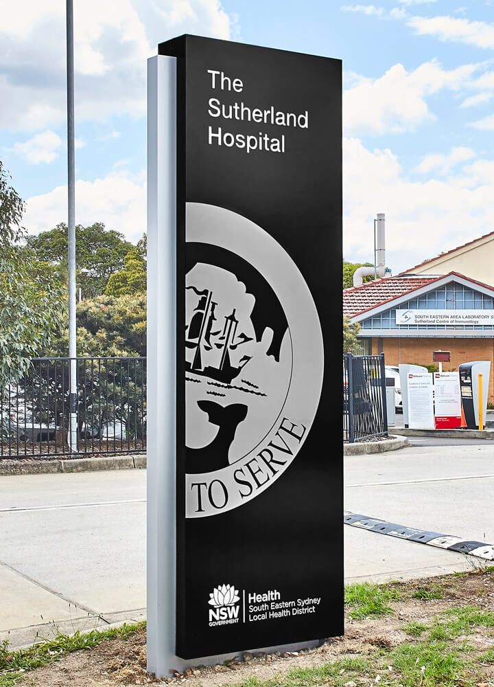
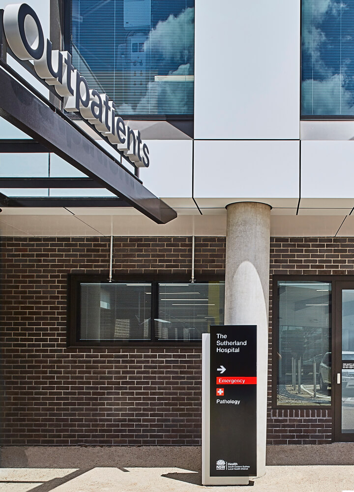
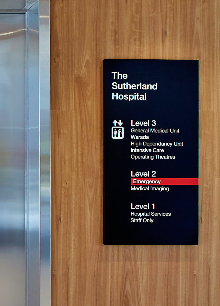
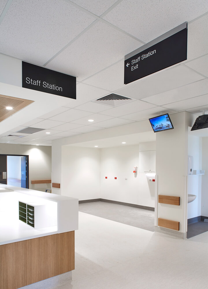
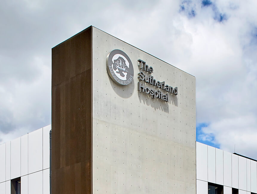
Last year, BrandCulture was commissioned to implement a wayfinding strategy for a four-storey, start-of-the-art building designed by BVN, which houses the new Emergency Department at Sutherland Hospital.
Visiting Emergency is invariably stressful. It’s a place where visitors are often panicking, frightened for themselves or loved ones, so we knew Sutherland Hospital’s new wayfinding system needed to provide absolute clarity to flustered visitors who may not be thinking clearly.
“Hospital wayfinding is ‘wayfinding’ in its purest form because the sole function of signage is to provide directions and assurance in an uncomfortable situation. You can’t risk having people lose their way en route to Emergency,” explains Nick Bannikoff, BrandCulture’s Design Manager.
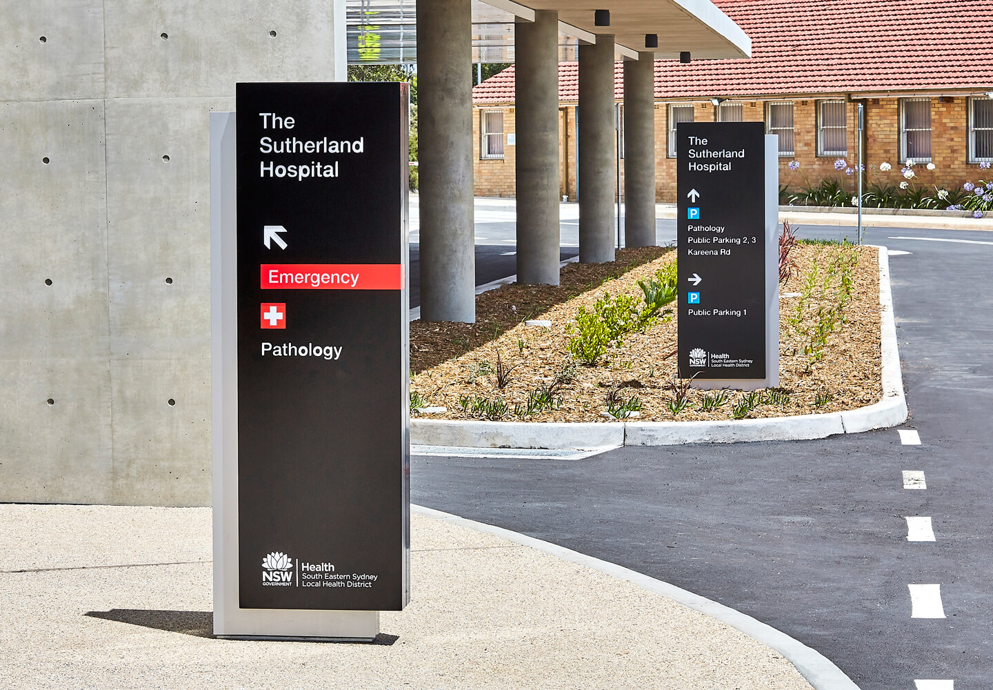
In the process of designing a new Emergency Department, BVN reconfigured the main access into the hospital, impacting key vehicular and pedestrian circulatory paths. To help visitors navigate these changes, Richard Crookes Constructions asked BrandCulture to review and refine the signage designs and location plans. (We were actually recommended by AW Signs, having worked together at Forbes Hospital.)
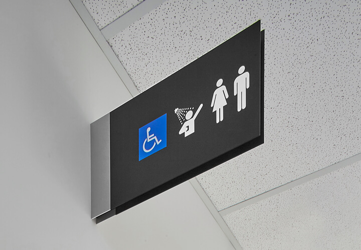
We conducted extensive user interviews, consulting everyone from the maintenance team to the nursing staff to understand how people navigate the hospital. After mapping all external and internal sign locations, we refined and implemented identification signage and wall graphics, and relocated the Emergency sign to improve its visibility.
It was a collaborative effort involving a large and diverse team of stakeholders. We’re immensely proud to have played a role in creating a wayfinding system that minimises stress in a stressful environment.
