Our donor wall and pool graphics form inspired backdrops inside the Performing Arts Centre at St Catherine’s School Sydney
We’re proud to unveil our striking donor wall and vivid pool graphics inside the Performing Arts Centre (PAC) at St Catherine’s School Sydney. Both design pieces form inspired backdrops inside the new landmark building.
St Catherine’s has a long rich history and since its inception has been built, supported and shaped by its community. The PAC was made possible thanks to the generous contributions of its donors. The Learn to Swim Pool has been named after the incredible Barry Rodgers, a passionate elder St Catherine’s lore who taught generations of girls to swim.
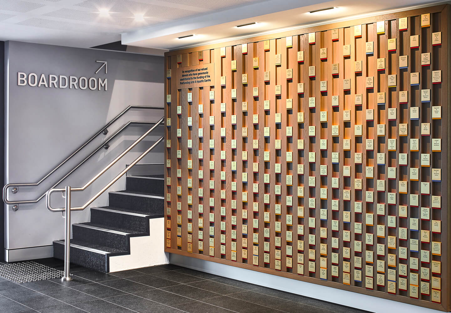
BrandCulture were commissioned to design two centrepieces that honour both these legacies. Firstly, a recognition wall to commemorate everyone who has generously donated to the construction of the Performing Arts Centre and secondly an installation that runs the length of the beloved Barry Rodgers’ Learn to Swim Pool.
Making waves
Donor walls can be about thanks and gratitude or encouraging future generations to build strong relationships and foster a culture of philanthropy – these philosophies mirror the values of the St Catherine’s family, and it was important for us to ensure the final design complemented them, honour the schools legacy and resonate with the community.
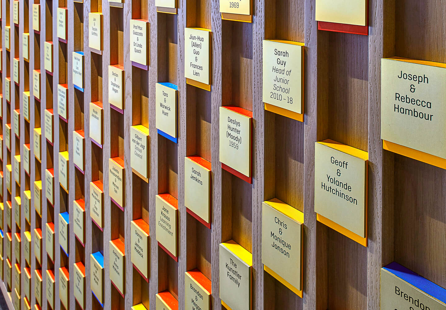
From a design perspective the donor wall needed to be visible and legible but not dominate the space, we needed to be cognisant of the feature artwork and complementary to the interior finishes. Practically the installation had to acknowledge over 350 donors in several tiers of significance without any digital solutions.
Our final design is both subtle and energetic, textural and refined. Inspired by waves as an allusion to the activities that take place in the PAC, we created a centrepiece that subtly undulates across the wall. A coruscating wave of polished brass plaques integrated with the vertical timber channels reflect the light to help catch the eye of those passing by. Small primary colour tabs help to signify the tiers of significance, adding colour but not over-saturating the environment. In its presence, the coming together of the plaques is reminiscent of a crowd gathering to see a performance, an apt metaphor for the environment it resides in.
Looking down on creation
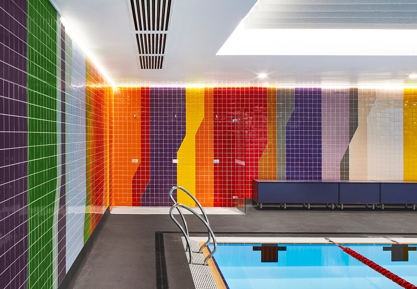
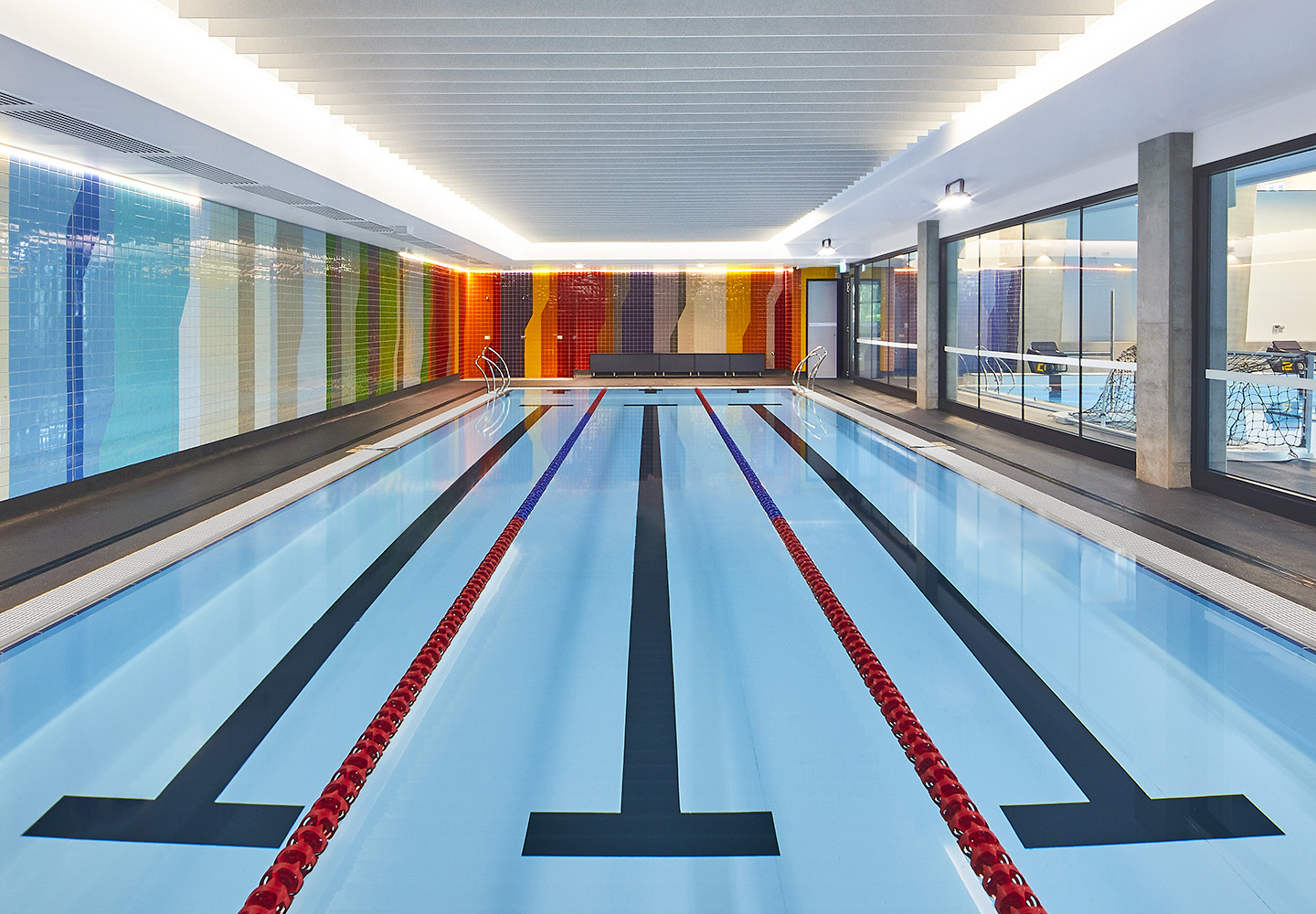
Barry Rodgers was the embodiment of grit, determination and resilience, a bright personality that lit up St Catherine’s pool, inspiring multiple generations through his teaching. A titan of the surf, Barry like his students spent countless hours along the eastern coastline and the neighbouring suburbs that can be seen in the distance from St Catherine’s and that form a part of the experience of learning and growing up in the eastern suburbs. It was this local context and the energy of Barry that inspired the brilliant backdrop of the Learn to Swim Pool.
The installation represents the intersection of place, learning, and growth. An abstract portrayal, comprised of thousands of high-gloss, glazed porcelain tiles divided into multiple sections that depict the view of Coogee beach from the air where the colours of the deep-sea morph into the shallows and then the sandy beach. Backed by the park and road behind the beach, the view then stretches over roofs tiled in earthy tones with a sunset just tinging the horizon of a deepening blue sky – a lively and fitting backdrop for such a significant space.
Design integrity
At BrandCulture we like to build and foster strong relationships within the design community. We agree with St Catherine’s when they say strong relationships contribute to a fulfilled life and inclusive participation in society. So when the opportunity arises to offer our design services for causes that uphold the integrity of both our organisation and our client were all too happy to abide.