BrandCulture implements a holistic wayfinding strategy at Dubbo Base Hospital, helping patients, staff and visitors navigate the sprawling environment.
Dubbo Base Hospital has undergone a major redevelopment over the last decade and we are proud to play our part in facilitating improved healthcare delivery and increased staff and patient wellbeing through our carefully considered wayfinding solutions.
Playing the long game
In 2016 we were engaged by HDR to design and deliver the signage for all works pertaining to Stages 3 & 4. An already sizeable scope of works that included a combination of new purpose-built infrastructure and the relocation of the Emergency Department, the hospital continued to evolve over time. New medical units were added, the new innovatory Western Cancer Centre was built plus a subsequent new thirty-million-dollar multi-deck car park was erected to allow for the expansive growth.
In addition to the new infrastructure all external works moved from the forecourt to the entire site; what began as a select set of works, over the span of six years, turned into a project of multiple moving parts. The wayfinding strategy we conceived at the very beginning survived it all.
Utilising colour and naming
Our analysis of key travel paths and nodes both externally and internally as well as substantial stakeholder engagement helped inform a signage strategy guided by best practice principles which established a series of key recommendations. This included the need to retain the core of the signage suite created by Cox Architects for Stages 1 & 2 while creating extensive functional enhancements to meet the needs of the wider site and disparate architectural treatments
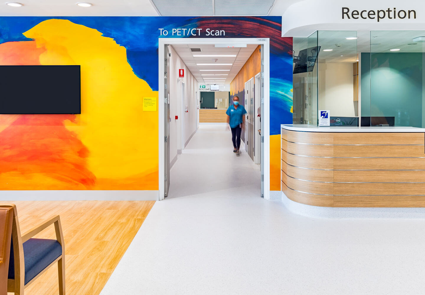
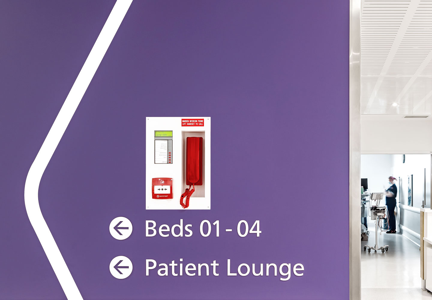
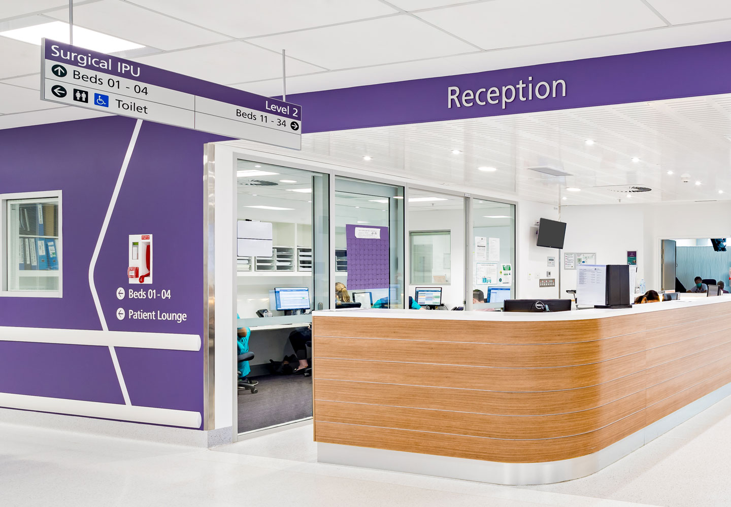
One of the key changes was the adoption of colour and naming as key wayfinding elements, whereas the Stage 1-2 strategy used a full palette of colours in a single building, we identified early on that this complex site would benefit from naming and colour coding regions and buildings – this achieves a simplified cognitive map of the site, allowing wayfinding to first direct to a geographic region, and then providing onward directions to the final destination. We reserved yellow for the Western Cancer Centre due its synonymity with the daffodil.
Aesthetic surgery
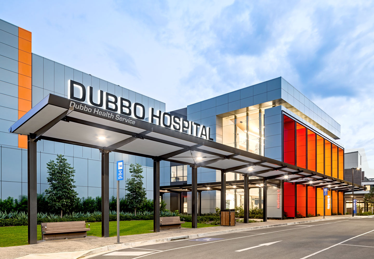
We designed bold large-scale graphics inspired by the meandering Macquarie River that runs adjacent to the hospital, the flowing graphics created to help guide users from one faculty to the next.
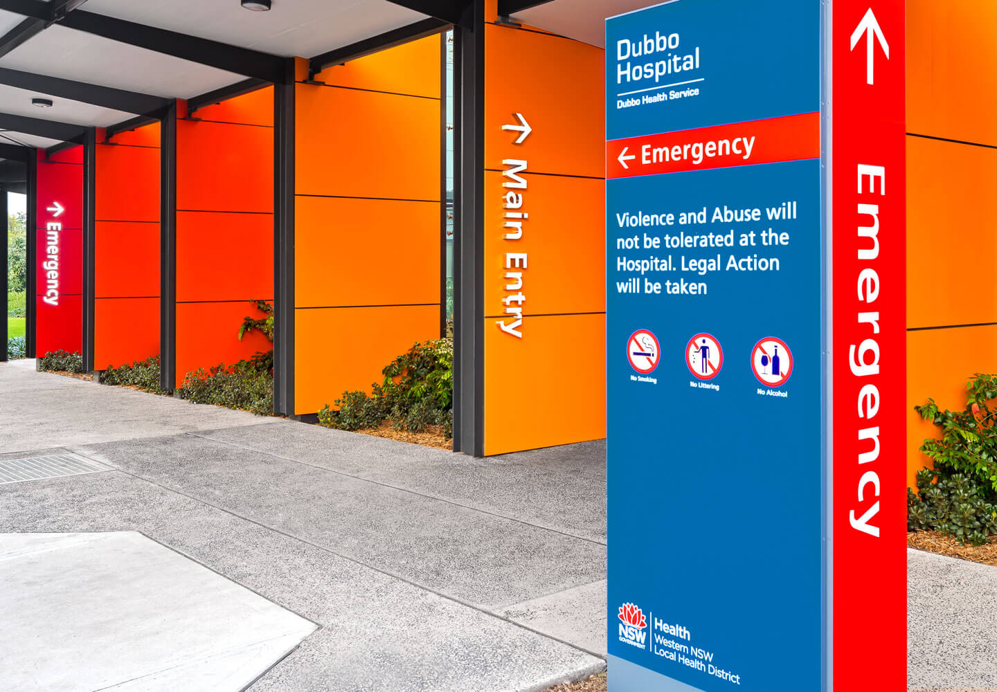
Externally, we’ve ensured identification signage is located prominently at key portals, helping to better distinguish the Emergency department and alternate entries. We’ve formally identified all parking facilities to simplify wayfinding messages at key vehicular decision points. The exterior signage suite now uses a darker blue to provide maximum contrast and a more consistent typographical layout to improve overall legibility.
Providing superior healthcare infrastructure to remote communities
We know all too well the complexities of hospital environments and the stress it induces, our extensive knowledge in this area has awarded us the honour of collaborating with some of Australia’s finest architects to help plan and execute universal design principles, ensuring safe, comfortable and confident user experiences for all – Dubbo Base Hospital is no exception to this. The redevelopment has now cemented Dubbo Hospital’s place as a major rural referral centre and acute care hospital for specialty services in Western New South Wales.