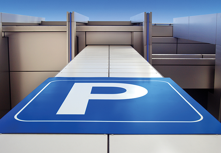
When it comes to creating first impressions, a lot of thought and design goes into a building entrance, but how much goes into the car park?
A building’s car park is often a person’s first physical contact with a brand or destination. It’s the place to create that all-important first impression. Yet, traditionally car parks have been uninviting, disorientating, and – thanks to Hollywood – sometimes a symbol of danger.
The experience a person has in the car park can impact their view of the place they are visiting. While car parks have often served as an afterthought in the design process, there is now an increased focus on creating more welcoming and enjoyable environments that are easy to navigate.
Creating a car park that looks good, functions effectively, and creates a positive experience can be a challenge; however, it is possible with environmental graphic design and wayfinding design systems. At BrandCulture, we’ve been perfecting our car park wayfinding and signage approach for more than a decade.
Creating highly distinctive wayfinding
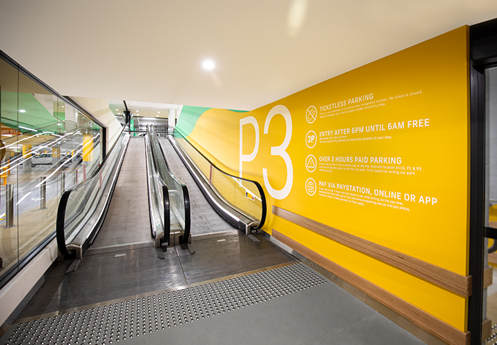
Wayfinding plays a crucial role in how people experience complex built environments – and this is never more evident than in car parks. Viewing distances, blind spots, and poor sightlines can all present challenges for wayfinding. Employing innovative techniques such as cognitive mapping and circulatory navigation is crucial to creating a practical and functional system for users.
Elements such as colour contrast, memorable graphics and landmarks are hugely important to help provide an identity and connection to the space. When designing the wayfinding system for Westmead Hospital Car Park, we incorporated identification signage, directional, statutory, and super graphics, as well as pylon signage. All the signage provided a natural connection with the architectural landscapes and highlighted main entries and arrival points. We also used high contrasting iconography and message identification to minimise disorientation and the ‘getting lost’ stress.
The importance of colour
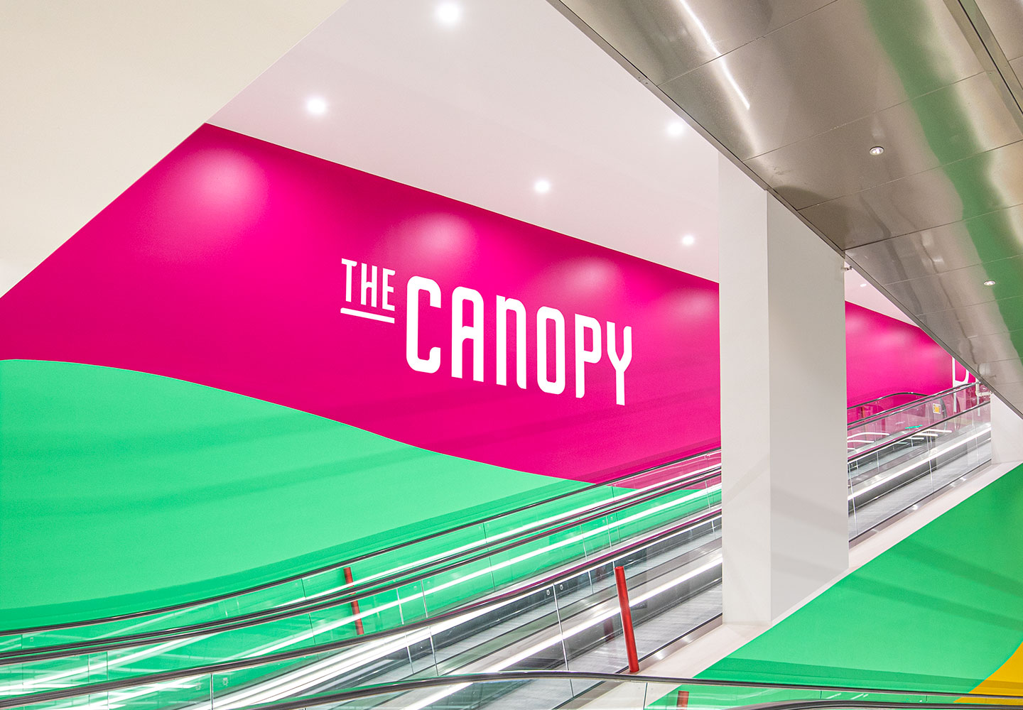
Bright, colourful, clear signage throughout a car park is crucial for the user experience. Not only does it help create a strong and positive first impression, but it can also help create a sense of safety and help eliminate stress. Making a bold colour scheme can provide strong visual cues to help visitors navigate the space and remember where they parked. In our award-winning design for World Square Car Park, we used a bright colour palette and memorable shades in the lift lobby areas to identify the different levels and locations and help visitors navigate the vast car parking area. Incorporating colour into floor decals and markings is also a strong guide for wayfinding within car parks and using lighting to help visitors navigate through large complexes.
Adopting digital technologies
As digital technologies evolve, even car parks are becoming more connected. The use of sensor systems and number plate recognition systems are helping car parks to become even more efficient environments. New technology advances are helping create digital wayfinding systems which can integrate into smartphone apps and link number plate recognition to sensors to guide users to their parking space.


