Wayfinding design principles draw heavily on bold colours and strong visual clues, but what are the rules when wayfinding for children?
Great wayfinding design is intuitive and seamless; it guides users through spaces efficiently and effectively. It is as much about signs and arrows as about environments and how people respond to spaces.
Because wayfinding design systems need to be accessible to everyone, they rely heavily on strong visual aids to overcome language or cultural differences.
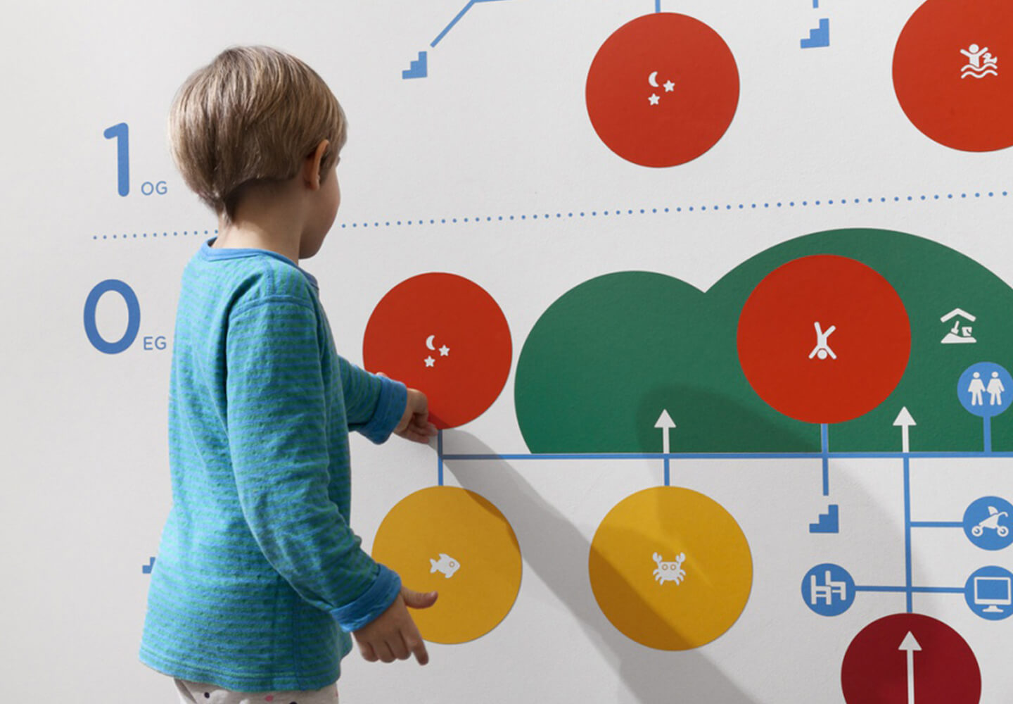
However, when it comes to wayfinding design for children, there are a number of other factors to consider. Using bright colours to attract a child’s attention, images, pictures and pictograms are essential for children who may not be able to read or understand words, this is particularly important when navigating unfamiliar spaces such as hospitals or airports.
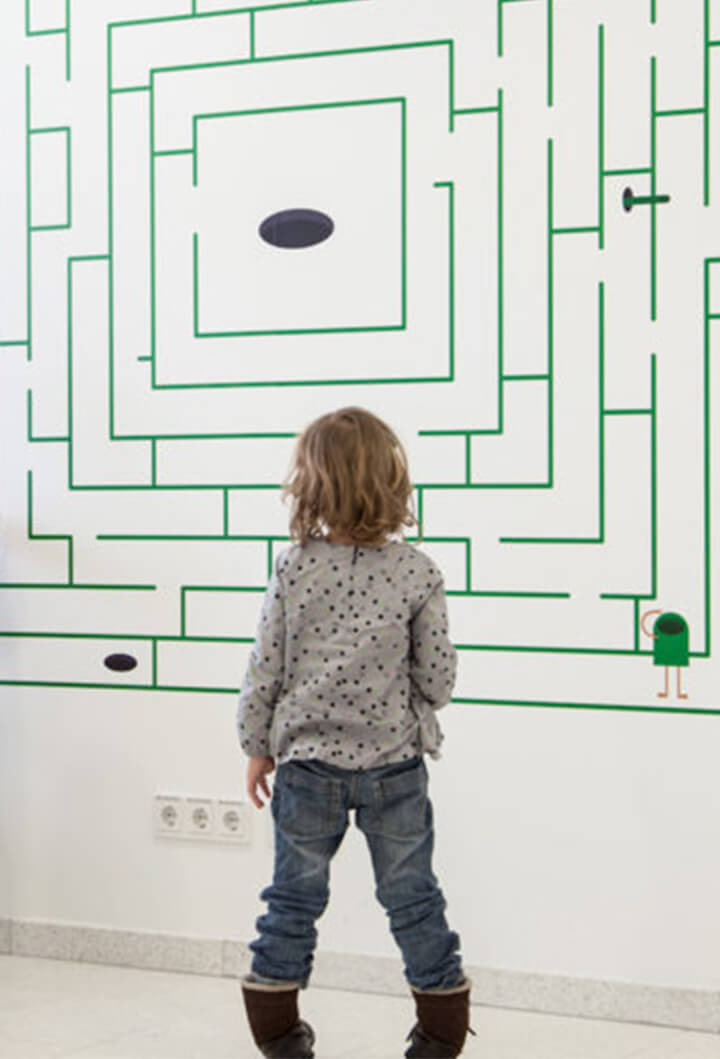
Employing textures such as tactile signs, interactive displays, sounds and installations are also a useful way to engage and entertain children. Adding an element of play or exploration is a great way to maintain a child’s focus – elements, such as image-based maps, is a great way to help children create a visual path. We’ve touched on this in our previous post about multi-sensory experiences.
A key element to children’s wayfinding design is to place all information lower to the ground to accommodate for smaller people and ensure the designs are accessible and impactful.
Employing memorable landmarks is another important principle for children, as children are more likely than adults to use these features to encode a route into their memory and understand which way to turn or walk.
Wayfinding design for children is often used in playgrounds, childcare centres, schools, and libraries to help kids to navigate between the different spaces with minimal stress and without confusion.
It is also used to entertain, distract and calm children, this is particularly useful for locations such as Children’s Hospitals and Airports, which can be stressful, overwhelming, especially when children have to spend extended periods of time waiting.
Creating wayfinding design systems for children is a creative and exciting adventure for designers. We are currently working on a very exciting project incorporating children’s wayfinding and sensory experiences and we can’t wait to share more about this in the future.
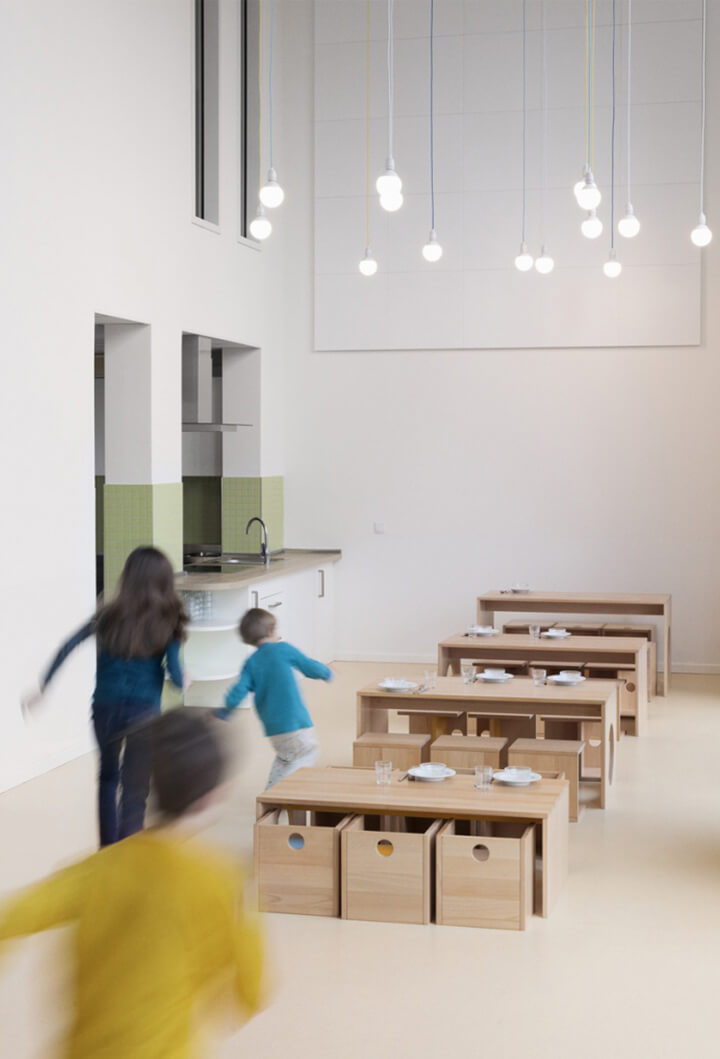
Above: The Company Kids Hafencity Daycare Centre by Beukind. Below, clockwise from top left: Paediatric Clinics at the University Clinics in Salzburg by buero bauer.


