In Part 2 of our series on telling historic stories, we explain why designing interpretive signage for heritage spaces is an “intensely creative field” of design.
There are two kinds of people in this world: those who rush past interpretive signage in a race to reach their destination, and those who are fascinated by reading tales of Sydney’s past.
Nick Bannikoff, BrandCulture’s Design Director, admits he falls into the latter category. “I’m the kind of person who stops and reads interpretive graphics and interpretive signage whenever I see it,” he says.
Interpretive graphics are used to create a narrative about a place, workplace or tourist destination, enhancing the user experience by sharing tales from the past.
Interpretive signs and installations are scattered all over Sydney. Not only does Nick love reading interpretive signs, he also loves designing them. “There are so many ways you can approach heritage interpretation. It’s an intensely creative field of design that goes far beyond signage. If you have an open-minded client, you can interpret the history of a place in really exciting ways.”
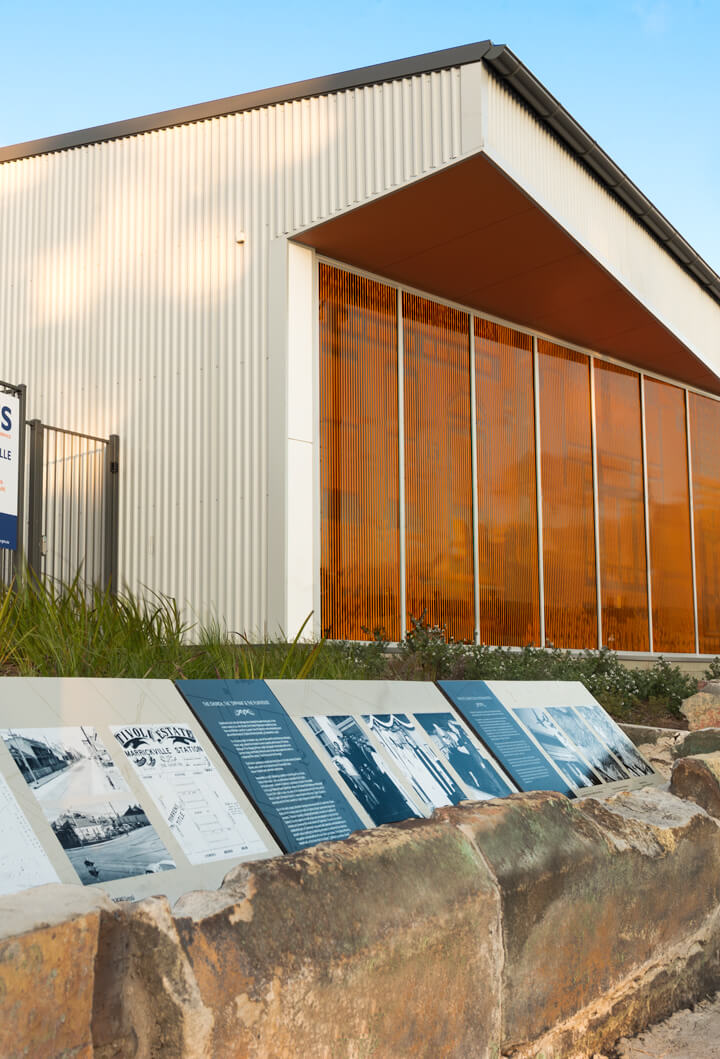
A good example is the site of SES Marrickville, where a community of houses disappeared to make way for Sydney Airport’s third runway. Marrickville Council approached BrandCulture to design interpretive and environmental graphics for the new facility, celebrating the site’s remarkable history. Set within the garden beds, you’ll find the site’s original street numbers, immortalising the terrace houses that once lined the street.
“I do have a penchant for discoverable design elements,” says Nick. “The street numbers embedded at SES Marrickville’s headquarters are so subtle and engaging. If you are designing graphics in the public domain, remember that there are people who walk past every day. I love introducing discoverable elements that don’t become stale or tiresome – they’re designed to be discovered and appreciated over time.”
When designing interpretive graphics, it can be tempting to convey too much information where less is more. “One of the pitfalls of interpretive graphics is that designers try to explain everything that ever occurred in a place. You need to tone it back and figure out what’s exciting to different audiences. You can’t just pitch your story to history buffs – too often interpretive signage is pitched at just one audience,” says Nick.
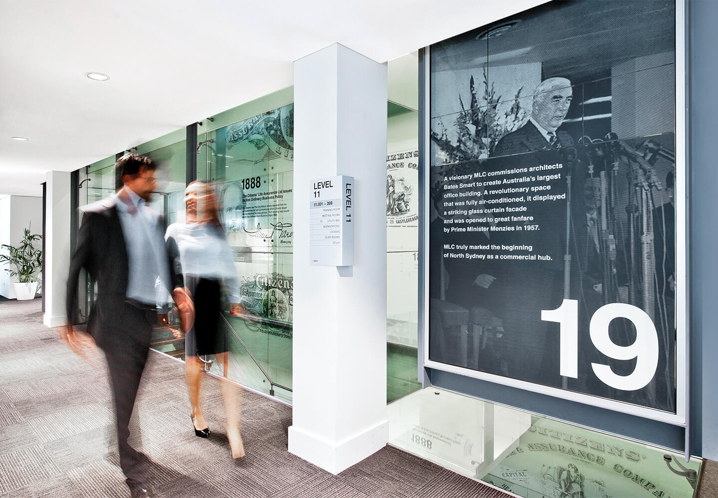
When done well, interpretive graphics can greatly enhance a sense of place and community. They can also form an important part of a company’s cultural identity when incorporated into the workplace, as BrandCulture has done for leading historic Australian brands from Sydney Water to MLC and Westfield.
BrandCulture is currently designing interpretive signage for an exciting residential development. We’re also working on interpretive graphics for a new performance space – we’ll share more details soon!
• Read Part 1 of our series on heritage environmental graphics here