Designing accessible built environments shouldn’t be seen as an added cost or inconvenience, but as an opportunity for creativity.
Did you know that one in five Australians suffers some form of disability? According to the Australian Network on Disability, people with disability are also three times more likely to avoid an organisation and twice as likely to dissuade others if the organisation is seen has having a negative diversity reputation.
In other words, accessible design is good business. It shouldn’t be seen as an added cost or a compliance requirement, but as an opportunity to increase patronage, broaden your audience and grow your bottom line.
One of the more hidden barriers to accessibility is wayfinding design. Without appropriate wayfinding information, many environments are inaccessible for many visitors. A sign made up solely of text may be confusing to someone who can’t read English, or is dyslexic, or blind. A two-dimensional map may be confusing to someone with cognitive impairments or dementia, for example.
Defining accessibility and inclusivity
When designing for access, it’s important to create inclusive environments for all people, regardless of their mobility, visual, auditory, physical or cognitive abilities. The challenges that someone with dementia might face versus someone who is colour blind, versus someone who uses a wheelchair, are vastly different. It’s important to work with designers who use a very broad definition of ‘accessibility’, and who can advise you on updates to the Australian Wayfinding Standards and accessibility compliance laws.
It’s equally important to engage diverse user groups at the outset of any design process, and consult them regularly throughout the process. “A public building has everyone as its client, after all,” writes The New York Times.
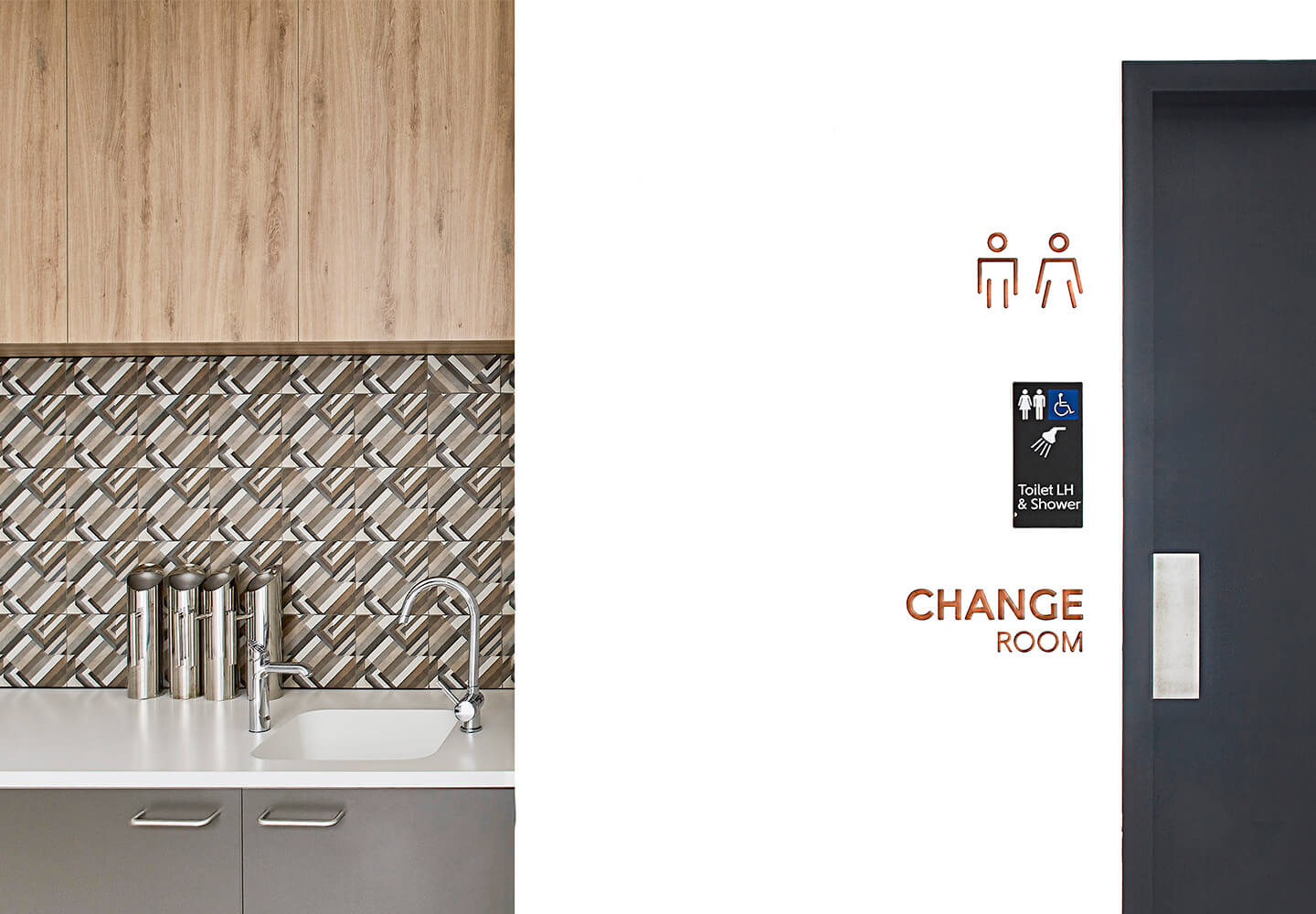
To comply with disability regulations, there is a tendency to tack on ramps and railings without regard for aesthetics or to design signs using clinical colours like white, grey and hospital green. This can result in environments that feel unwelcoming, or can even induce anxiety. When we were working with Sargood on Collaroy, a luxurious facility that supports people with spinal cord injury, we wanted our wayfinding system to enhance the venue’s beauty and function as a place for healing – as opposed to feeling like a sterile rehab centre. We believe designing for access can actually help to facilitate healing inside healthcare environments.
Things to consider when designing for access
There are lots of tools at your disposal when it comes to creating inclusive environments that are welcoming to people of all ages and abilities.
Signs are a good place to start. Make sure you use a mix of text and icons or graphics, with enough luminance contrast to enhance legibility. Minimum luminance standards often do not go far enough, according to Vision Australia, which suggests architects and wayfinding designers should look at going above and beyond where possible to ensure the safety of people who have low vision.
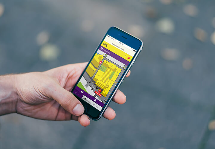
Digital innovations are another great tool. Bluetooth beacon wayfinding can be used to alert someone with low vision of their position and closest landmarks, for example. At UTS, we designed digital signage that converts text-to-speech, provides language translations for non-English speakers, and connects to personal wayfinding apps. This means visually impaired users can navigate the UTS campus using text-to-speech guidance.
As experiential graphic designers, we love creating murals, super graphics and art installations to create landmarks that help people to orient themselves. These can be especially helpful for people with declining visual capacity, while tactile installations – like NGV’s water window – can provide delightful discoveries for people with low vision.
Using contrasting colours is a great way of drawing attention to different zones, or creating landmarks for orientation. On the other hand, an overload of patterns and colours can be confusing to people with dementia or cognitive issues, which is important to keep in mind when designing healthcare facilities. Tactility and textural changes, like Tactile Ground Surface Indicators, are another useful orientation tool.
Most importantly, remember that designing for diversity may require a change in mindset within your organisation. Instead of seeing accessibility as a pesky legal requirement, look at it as an opportunity for creative thinking to grow your audience and design for a cultural need.
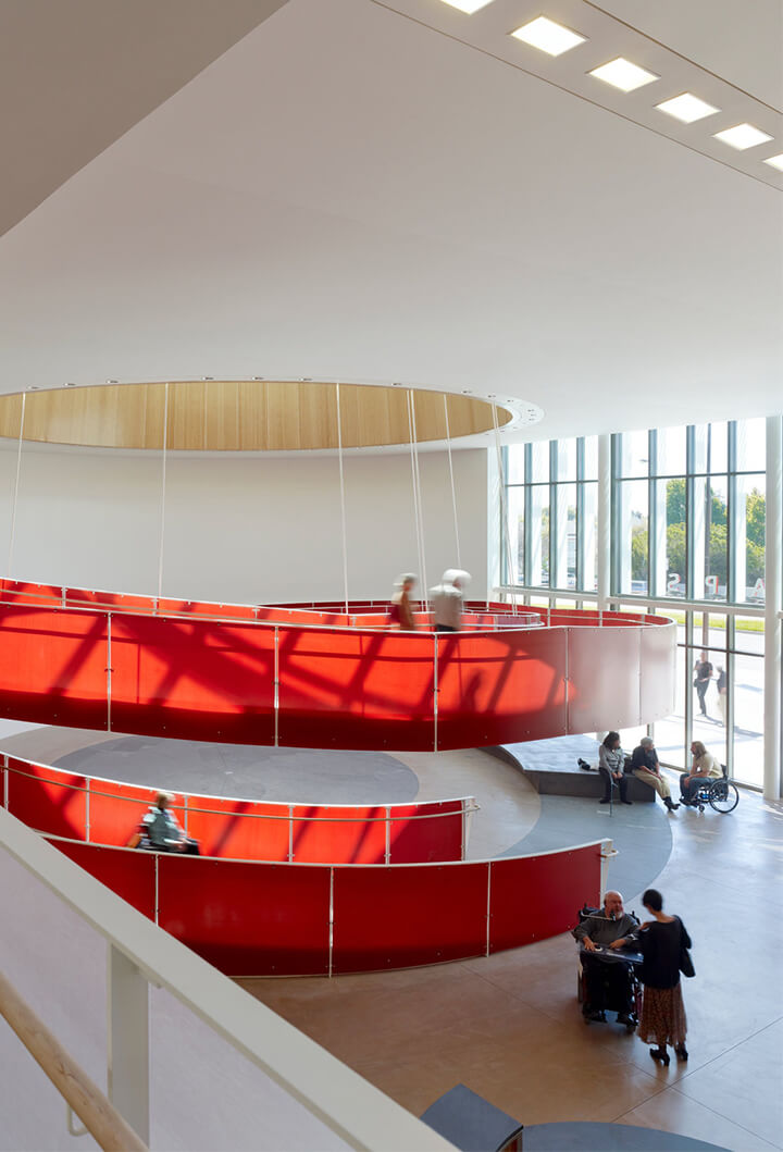
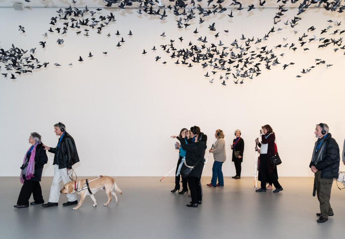
To find out more about BrandCulture’s Accessible Wayfinding services, click here. Pictured above: NGV, Melbourne. Below, clockwise from left: Ed Roberts Campus in Berkeley; UTS wayfinding app; BrandCulture’s wayfinding designs at Sargood on Collaroy.


