BrandCulture’s environmental branding project devised for The Department of Agriculture, Fisheries and Forestry covers more than 38,000 square metres across two buildings in Canberra. The site required a complete brand experience that would represent the department appropriately to all staff, suppliers, visitors and clients.
Working with Reid Campbell, BrandCulture created a branded environment to reflect the Department’s varied role across Australia, with the geographically diverse landscape of Australia forming the basis of the wayfinding system and theming of the Marcus Clarke and London Circuit buildings.
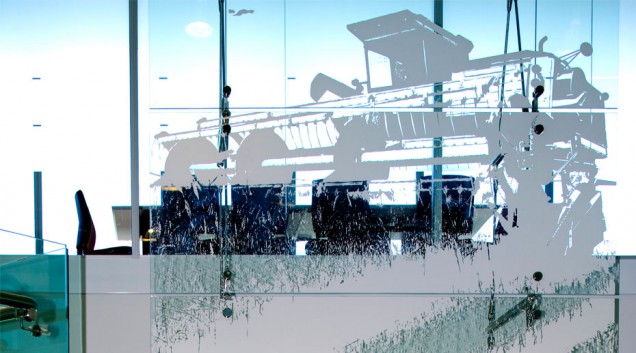
Glass and stainless steel structures featuring monochromatic super-graphics form the centre-piece of each theme in the main Marcus Clarke building. Interconnected floors throughout the building alternate the themes. The top three levels house a 10-metre super-graphic feature adjacent to the staircase void.
Front-of-house areas display floor-to-ceiling iconic Australian images that span entire walls, emphasising the themes and values of the Department to all stakeholders. Consistent theme images were applied to the glass beside each meeting room and office entry, allowing visibility and transparency from the outside in. This also cleverly provides an effective level of privacy for meeting room occupants while adding visual impact and embellishment of the theme.
Staffs working areas display time-lapse graphics showing the everyday experience of individuals in industries represented by the Department: agriculture, fisheries and forestry. The rising and setting sun in the background creates a strong visual link between each floor and reflects the rhythm of the working day tied endlessly to the natural environment.
Large wayfinding panels feature in each lift lobby. Expressed through different colour schemes throughout the building, they communicate the themes that underlie the Department’s focus. Three sections can be updated individually – floor theme, map and business units. They are easily altered as the groups expand, contract and change, to cater to the Department’s commitment to the public benefit. Bespoke iconography was created for easy readability and to aid navigation, orientated in line with the geography of the building. From services such as IT, basic facilities and meeting room locations, these panels are key for guiding those who are unfamiliar with the floor layouts in both buildings.
