Our senses play a huge role in how we experience the world, whether consciously or unconsciously, but can they be harnessed for placemaking or wayfinding experiences?
How we smell, touch, hear, and see things in the built environment can profoundly impact our perception and experience of a place. While architecture and design focus on materials and form – they also incorporate people and the rich tapestry of their emotions in play with the environment, space and the relationships between them.
Multi-sensory experiences have been heavily explored within exhibitions and installations; however, they are now playing a significant role within placemaking and wayfinding due to the integral part they play in connecting people and places.
“Multi-sensory design understands the difference between the shallow and the deep, or the enveloping and immersive experiences that nurture us and those that overwhelm. It opens perception rather than swamps it with overload. It does not drown and drain identity and instead enriches it in a paced and purposeful way.” Charles Landry.
We looked at how the senses are being incorporated into placemaking and wayfinding design to create stronger connections between people and places.
Sound
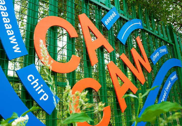
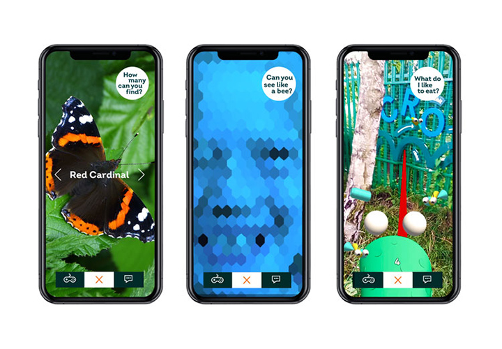
The use of ambient sounds to evoke the natural surroundings is a popular way to create a sensory experience. London’s London’s Thamesmead Tump 53 experience, by Alphabetical Studio, aims to engage local communities with the area, including five lakes and seven kilometres of canals. Incorporating environmental design features, typographic signs, sounds and an interactive augmented reality app, Thamesmead offers a multi-sensory experience, which also doubles as a learning experience. The colourful signs are made from recycled plastic bottle tops and reference the noises and movements of the local wildlife. This experience is then brought to life via the app, which uses animation, animal characters and sound design to bring the signs to life.
Sight
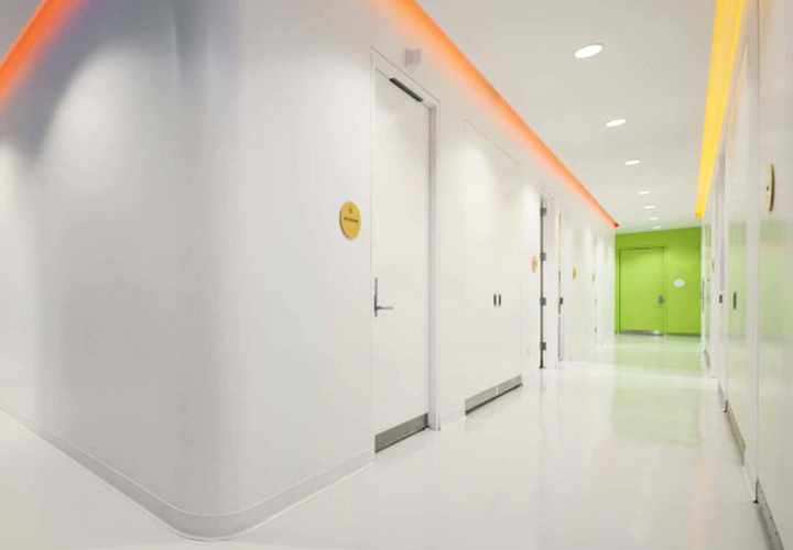
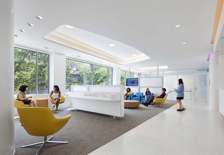
When it comes to vision, colour and light are powerful tools to help us find our way. They are also keys for wayfinding as they help us create mental maps to remember where we have been. Incorporating colourful lighting and feature walls is a great way to create multi-sensory experiences. The Planned Parenthood of New York City building by Stephen Yablon Architects, Entro and Cline Bettridge Bernstein uses bright and playful colours throughout the centre to help boost patients and staff’s spirits and energy levels. The light-filled space aims to provide an uplifting, positive environment for visitors, with large windows and skylights providing ample natural light. The centre also features custom graphics and coloured lighting strips which correspond with wayfinding to help people navigate through the centre.
When developing a placemaking strategy for Sydney’s landmark institution UTS Central, we created a vibrant light and colour display to engage passers-by and communicate the university’s leadership and global impact. The sensory experience was extended to the Dr Chau Chak Wing Building, where smart tags were added to signs to provide smartphone users to discover more about the history of the site.
Smell
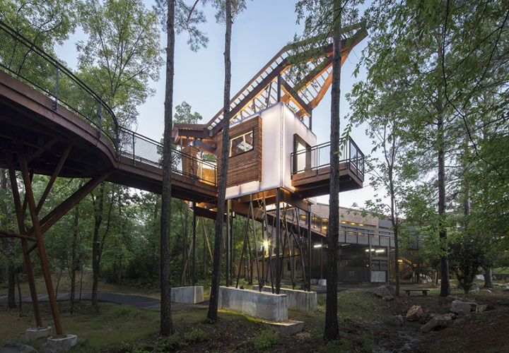
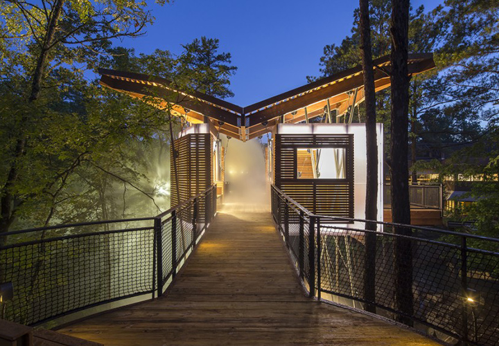
Scent can be one of our most potent senses, and the Mid-America Science Museum Treehouse has used this to significant effect within its multi-sensory experience. Created by Wittenberg, Delony, & Davidson Architects (WD&D), the treehouse is a 10-by-24-foot structure suspended above a stream connected to the museum by an elevated walkway in the forest canopy in Arkansas. The treehouse mixes the scents of its natural environment with the indescribable smell of rain which hangs in the air, provided by spray misters. The sprays also provide visitors with the sensation of light rain on their skin and create a dreamlike fog around the area. The treehouse features ambient music, which is activated when visitors touch the armrests on the bench seating.
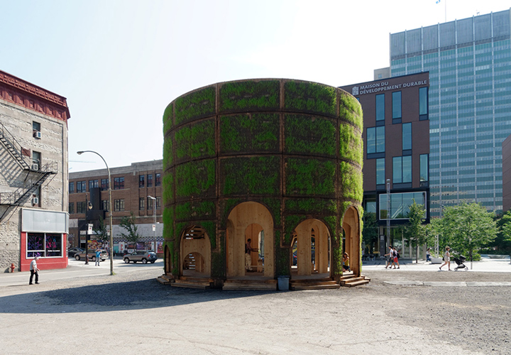
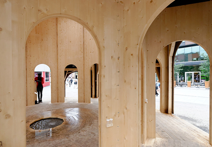
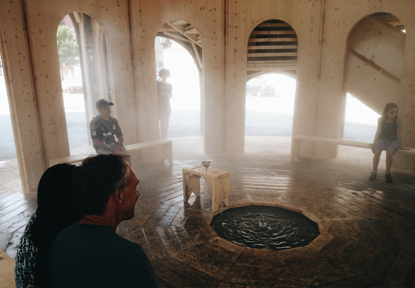
This immersive sensory experience was also expertly created by Berlin Studio Raumlabor for the 2014 Montreal Biennale. The Fountain House, a wooden pavilion constructed above a fountain in the middle of wasteland in the city. The pavilion served a multisensory experience for visitors through the living element of the structure, which featured grass and funghi on the inside and outside of the structure. Water from the fountain was pumped up the structure and small nozzles sprayed a fine mist into the enclosure to create vapour clouds within the pavilion.
Touch
Designing for the blind and visually impaired has seen the development of interactive 3D maps and signs which combine sound and touch. The University of Buffalo Center for Inclusive Design and Environmental Access (IDeA Center) and Touch Graphics have created talking, interactive maps for a number of locations. The maps provide audio feedback when touched to provide detailed information about the location and directions to move about. The tactile maps help people to create a mental map of the space and provide a sensory experience for all visitors. Some of the tactile maps also feature Google Earth projections to aid sighted visitors and make the maps a multi-sensory experience.
Above: The Fountain House, by Berlin studio Raumlabor for Montreal Biennale in 2014. Below, clockwise from top left: London’s Thamesmead Tump 53 experience, by Alphabetical Studio; The Fountain House, by Raumlabor; New York City Planned Parenthood Centre, by Stephen Yablon Architects, Entro and Cline Bettridge Bernstein; and the Mid-America Science Museum Treehouse, by Wittenberg, Delony, & Davidson Architects (WD&D).
