A great little documentary called ‘The Map’ launched late last year. If you missed it, here are a few key takeaways.
There are two kinds of people in this world: those who use maps, but don’t think twice about them. And those of us who think maps are beautiful marvels of design. Naturally, as designers who create city-wide transport wayfinding systems, we fit into the latter category.
So when ‘The Map’ launched last year, we were blown away by the story of New York’s subway map. The film condenses a decades-long design controversy into 10 gripping minutes. If you missed it, you can watch it here.
The Great Subway Map Debate
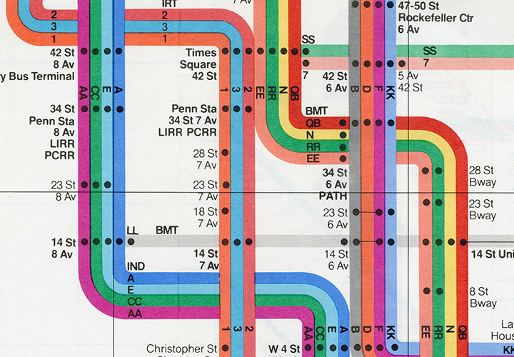
In 1972, designer Massimo Vignelli unveiled New York’s first unified subway map. True to the modernist tradition, his map is elegant and minimalist: a rainbow of colours ordered neatly into a grid.
Designers still love it today, but New Yorkers found it baffling. Despite being beautiful to look at, it had no connection to New York’s geography. If you needed to hop off near Central Park, for example, Vignelli’s map offered no hints as to which station was nearest. As Felipe Memoria, Partner at Work & Co says, “It was a battle between two different points of view: geography versus geometry”.
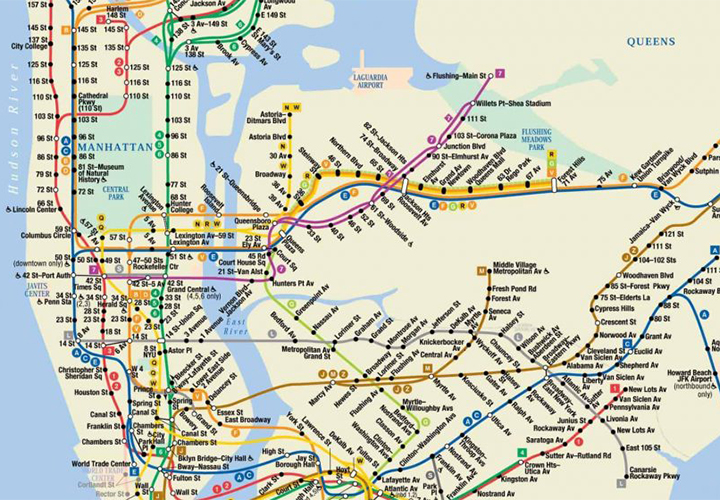
In 1978, Vignelli was forced to debate the merits of his map against a new map by Michael Hertz Associates, which is far more detailed. He lost, and the Hertz map has been in place ever since – until now.
The best of both worlds
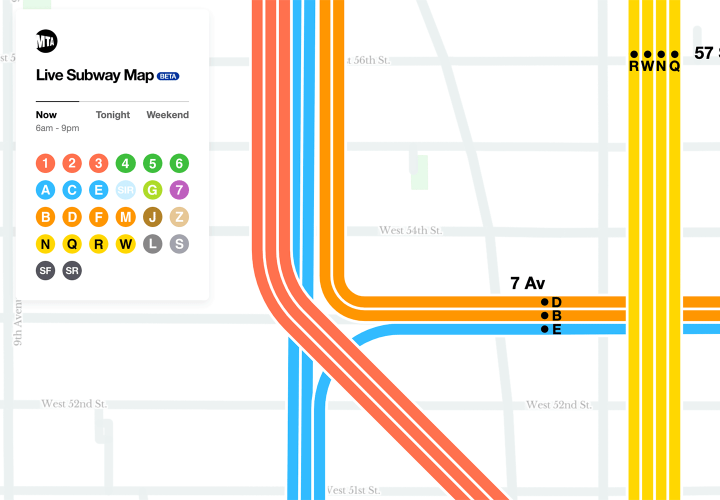
Last October, New York design studio Work & Co unveiled a new subway map that marries the elegance of the Vignelli map with the rich detail of the Hertz map. The more you zoom in, the more you can see nearby streets, landmarks and parks. This helps you orientate above ground.
Best of all, Work & Co’s map is ‘live’, which means it updates dynamically as lines go in and out of service, at different times of the week, or when trains start running in one direction only.
The project is mind-boggling in its scope: the New York subway is made up of 425 stops on 26 lines. Almost six million commuters take over 8,000 trips per day. As designer Michael Bierut said after seeing the new map: “[It] miraculously resolves the opposing design philosophies of Massimo Vignelli and Michael Hertz in a way that I suspect would please both of them.”
Key takeaways from ‘The Map’
So what can we learn? Here are a few points to ponder…
• The debate between geography vs. geometry is finally over. With today’s technology, it’s possible to combine both. Work & Co’s new subway map is interactive, which means you can see Vignelli’s clean lines along with Hertz’s geographic details the more you zoom in.
• Digital infrastructure is now critical, particularly in the COVID era. If you want commuters to feel safe, transport operators need to embrace digital technology to provide real-time updates and dynamic maps.
• Transit maps aren’t dead – they’re just continually evolving. Despite the fact that many people now navigate using their smart phones, we still need maps like Work & Co’s, which are designed to make sense of enormous complexity in a way that Google Maps simply aren’t.
• Transit maps of the future will combine the cartography of print maps with the dynamism of digital technology. As a studio that is already working with clients to create dynamic maps and real-time content, we hope to lead the way.
New York’s new live subway map can be found at map.mta.info. Pictured below, clockwise from top left: Vignelli’s map, the Hertz map, and ‘The Map’ documentary.
If you have a live mapping challenge you need to solve, we’d love to share our transport wayfinding expertise – send us a note to [email protected]