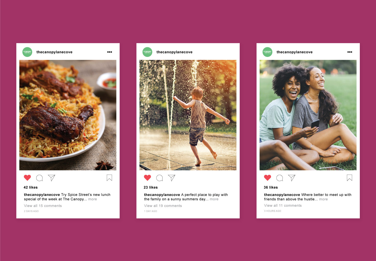
The Canopy in Lane Cove is a vibrant, multi-layered retail precinct and community space, with naming and brand strategies by BrandCulture. We facilitated workshops to create a naming strategy that honours the development’s Place Brand values, working closely with the community. With six names shortlisted, ‘The Canopy’ emerged as the perfect name to reflect the layers of Lane Cove. Just as a canopy creates a welcoming shelter within a forest, The Canopy is a leafy sanctuary with multiple layers and uses.
SOLUTION
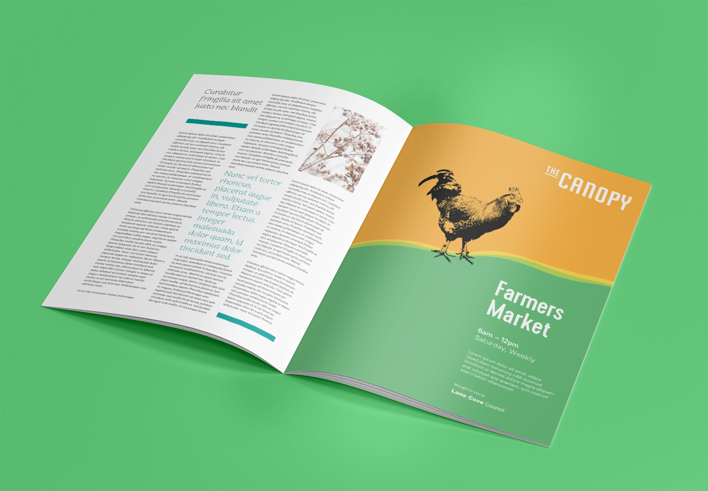
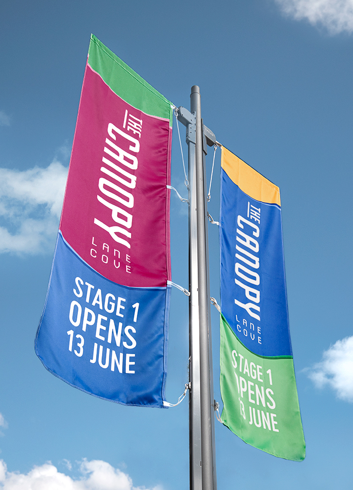
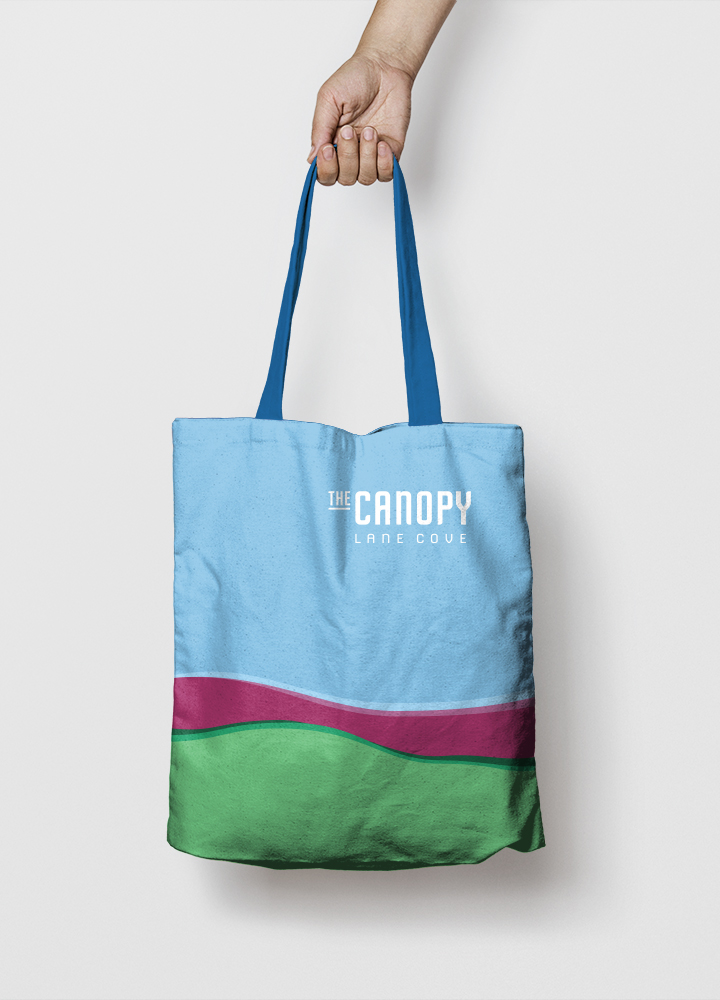
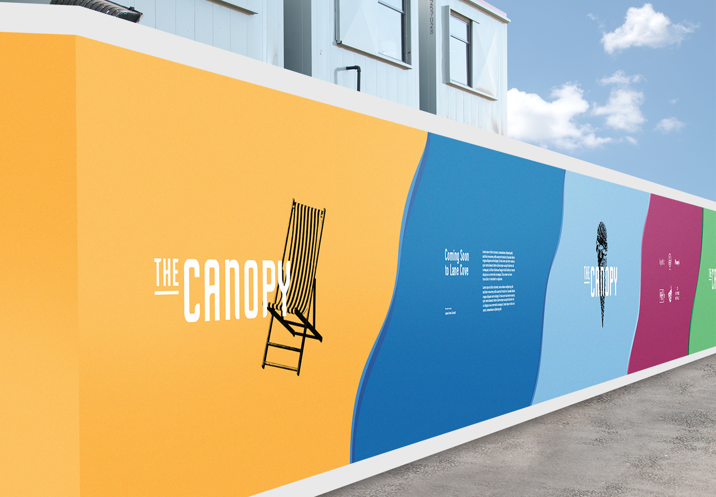
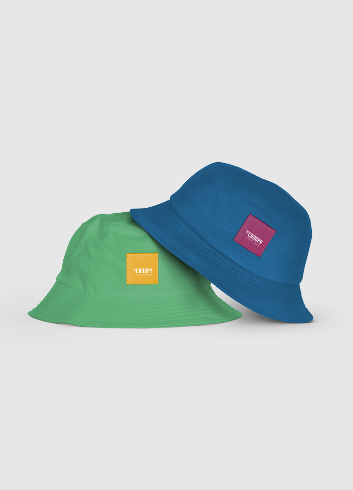
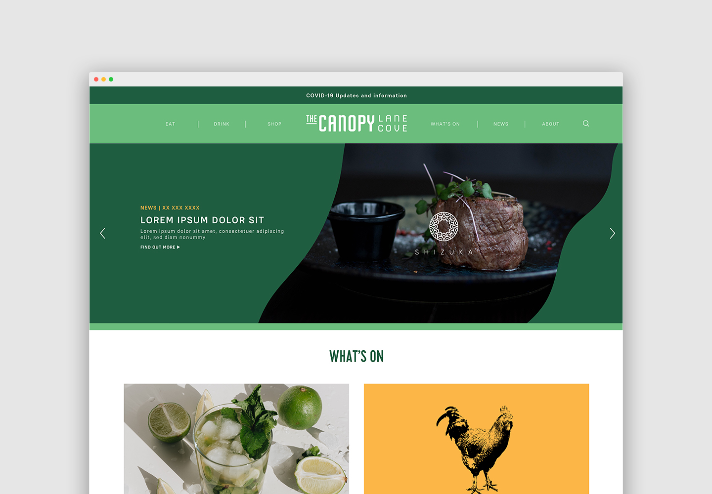
Bright layered colours play an important role in The Canopy’s branding, and are inspired by our research into the landscapes of Lane Cove. Dark blue signifies Lane Cove River; yellow depicts local sandstone; green symbolizes local parklands; purple represents urban areas; while light blue and white depict the sky and clouds.
At the top of The Canopy, the brand identity is embedded into the pavement, creating a sense of address. Hidden beneath are 500 car spaces across four levels. We devised a separate car park wayfinding strategy where each level is distinguished by The Canopy’s brand colours, improving orientation. The moment you see the colours and curves of The Canopy’s branding, you know you’ve arrived.