There is always a trade-off between practicality, authenticity, sustainability and cost.
We admit it. We’re obsessed. Not a little obsessed – we’re talking finicky levels of obsession when it comes to choosing the right materials for built environments.
Sometimes, the most beautiful materials are impractical: too slippery, too heavy, too unpredictable. If you choose materials that lack durability, there is an environmental cost, too.
Right now, we’re in the process of choosing materials for a beautiful donor wall. It’s a process we love, and it’s got us thinking about our approach to specifying the right materials for every project.
The importance of a cost-benefit analysis
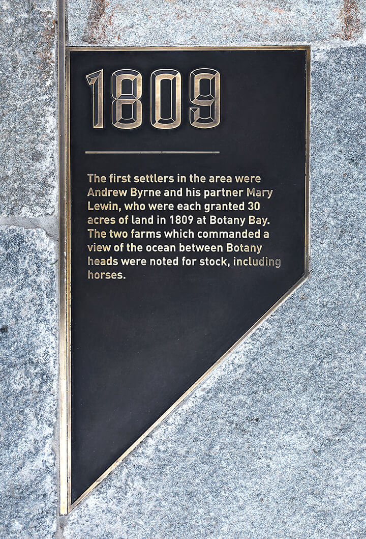
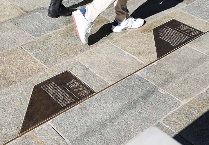
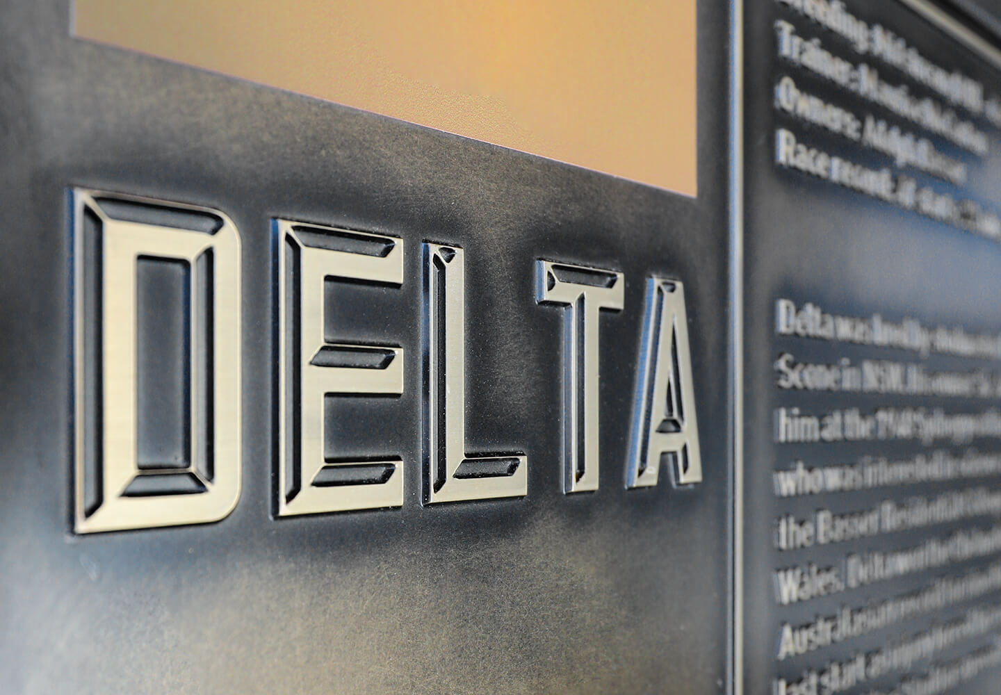
We recently created a site-wide Interpretive Plan at Newmarket Randwick, with implementation by The Blueprint. Bronze plaques are inlaid into the main pedestrian thoroughfare to celebrate the site’s history. Each plaque is cast traditionally in a foundry using a mould. The bottom surface is recessed, textured and paint-filled, while the top layer is polished to expose the beautiful material. Casting bronze can be expensive, but in this case, it was the only solution: we wanted a material so durable that people can walk on it for 100 years or more.
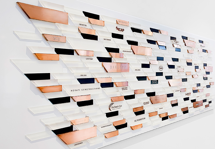
At Sargood on Collaroy, we spent hours researching materials for a beautiful donor wall that commemorates Sargood Foundation’s most generous supporters. The artwork is made up of three colours, each with its own finish. Charcoal shapes feature a paint finish. Translucent white shapes are made with satin acrylic. Bronze shapes are made using a metallic bronze finish.
Originally, we specified an electro-plated finish to achieve a rich bronze colour. Electro-plating meant finding the right supplier with precisely the right equipment to produce our designs. After conducting a cost-benefit analysis, the client opted for a metallic bronze finish instead, which cost less but still looks great.
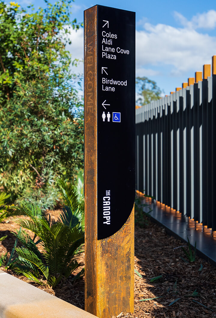
Similarly, at The Canopy in Lane Cove, we originally designed totems made from timber. However, there can be maintenance issues associated with using timber, so we recommended a rusted ‘Corten steel’ finish instead.
Corten steel is extremely popular, but it’s worth noting that many manufacturers will simply leave steel outside to rust to achieve the same look. The steel is then coated to protect it from the environment, whereas Corten steel has its own protective layer of oxidisation (after all, that’s what rust is). The latter option is more expensive but more authentic. The former option is more affordable and offers more control over the final look.
The best approach to specifying materials
Every design can be compromised by poor material choices. Colours may quickly fade beneath harsh UV rays. Fabrics may shrink if you choose the wrong printing process. Plastic films may warp or bubble under the hot Australian sun. Get it wrong, and you’ll find yourself forking out for a replacement much sooner than you hoped.
Here at BrandCulture, we combine an understanding of the macro (architectural) and micro (finite details and industrial design). This helps us to integrate our designs into your architectural palette. We find out exactly which materials your architects are using and what’s holding them up so that our experiential graphic designs complement them perfectly.
We also consider the weight of our finished designs. Many of our three-dimensional designs and signs look solid but are actually hollow, making them as light as possible for safety and engineering purposes.
There is always a cost-benefit trade-off when it comes to choosing materials. It’s important to work with a design studio that can help you get this right.
Below, clockwise from top left: Sargood on Collaroy’s donor wall; totems at The Canopy; and bronze plaques at Newmarket Randwick.
* If you’d like to pick our brains on choosing the right materials for your next project, don’t hesitate to say [email protected]
