Every fortnight on a Friday the BrandCulture team have a tradition of Show and Tell. When the clock strikes 5pm, we drop our Wacom tablet pens and gather around the table, nominating a team member to present a flight of fancy such as a recent holiday or challenging each other about design related topics. We’ve essentially adopted the nostalgic primary school exercise, except now we’re permitted to indulge in pale ales, a glass (or three) of shiraz and the Department of Health’s recommended monthly intake of saturated fats. And so we’ve decided to create a blog series, sharing some of our Show and Tell sessions.
Last week, the topic of discussion was ‘Posters from the 60s and 70s’. We perused a portfolio of pictures on the projector and guessed which one belonged to which team member, followed by an explanation as to why we admired it.
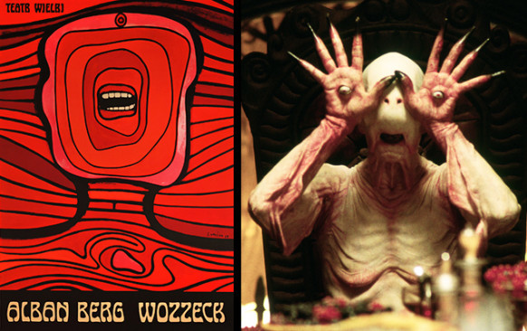
We expected Todd, our Senior Designer and zealous devotee to 60s and 70s music to produce a vintage psychedelic poster of Jimi Hendrix. But he surprised us with a far more abstract Jan Lenica lithograph titled Wozzeck, which we thought bore comparison with the Pale Man, the child-devouring albino demon from the film Pan’s Labyrinth. The humble character accompanied the poster with an anecdote from his days as an art school student, whereby his recreation of the lithograph couldn’t be distinguished from the original, earning him Honours status.
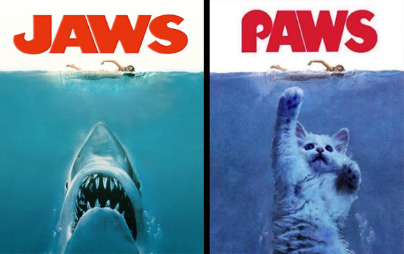
A pair of team members coincidentally had a similar palette for posters as Tash revealed the iconic Jaws movie poster and Jules set forth an image of a slightly less menacing aesthetic, with an appropriation of the film poster labelled Paws. It has become clear that his recent adoption of cats has mellowed him.
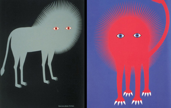
Honourable mentions include Nick’s nod to his Russian roots with a propaganda poster that activates the expression “the pen is mightier than the sword” and the two-tone advertisement for the Ueno Zoo by Japanese graphic designer Kazumasa Nagai, which could easily be mistaken for something that was composed today.


