
I shot the sheriff but I didn’t shoot no deputy.
Try getting that out of your head after a whole Show & Tell session dedicated to sheriffs… I mean serifs. Last week the topic was “Show us your serif”, where the BrandCulture team each selected a serif font we admired and discussed it over Pinot, Pure Blonde and Pringles. We at BrandCulture take our typography seriously, so much that we once had a quiz entitled “Arial or Helvetica”.
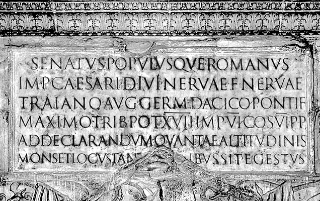
First up was Nick, who gave the team an ancient history lesson with an image of Trajan’s column. Completed in AD113, the freestanding column is famous for its spiral bas relief, which depicts the epic wars between the Romans and Dacians. A beautiful piece of art, the serif inscription translates to “The Senate and people of Rome [give or dedicate this] to the emperor Caesar, son of the divine Nerva, Nerva Traianus Augustus Germanicus Dacicus, pontifex maximus, in his 17th year in the office of tribune, having been acclaimed 6 times as imperator, 6 times consul, pater patriae, to demonstrate of what great height the hill [was] and place [that] was removed for such great works”.
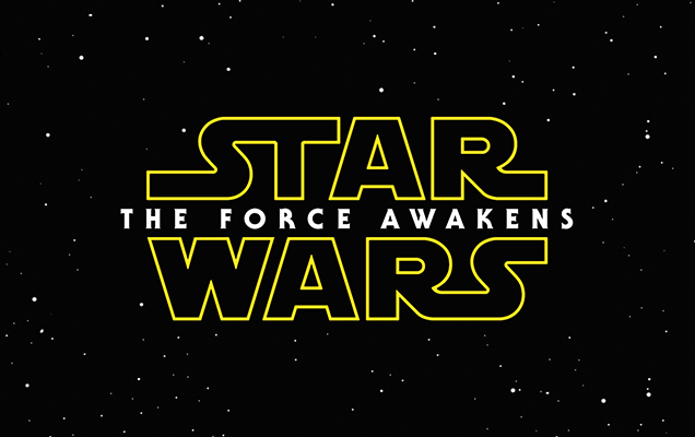
A debate was spawned when Tash’s image of the Star Wars: The Force Awakens poster posed the question of whether or not a serif was present. Being a 150 by 150 pixel image, the team (especially the designers) was certain that “The Force Awakens” was made up of san serif lettering, however a quick google search indicated that the words were embellished with subtle serifs. Show & Tell has certainly taught us that Tash needs a lesson or two on image resolution, but that’s another story.
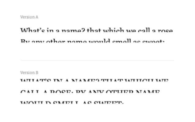
Show & Tells never cease to be educational as we once again received a typography lesson from Tom, informing us that serif faces are regarded as more legible than its amputated counterpart, as they are almost always used in print for large passages of text. The serif faces allow the eye to flow more easily over the text, improving reading speed and reducing eye fatigue. An image of the bottom half removed from a string of serif words showed us that lowercase lettering, as opposed to uppercase allowed for greater legibility.
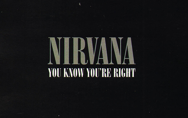
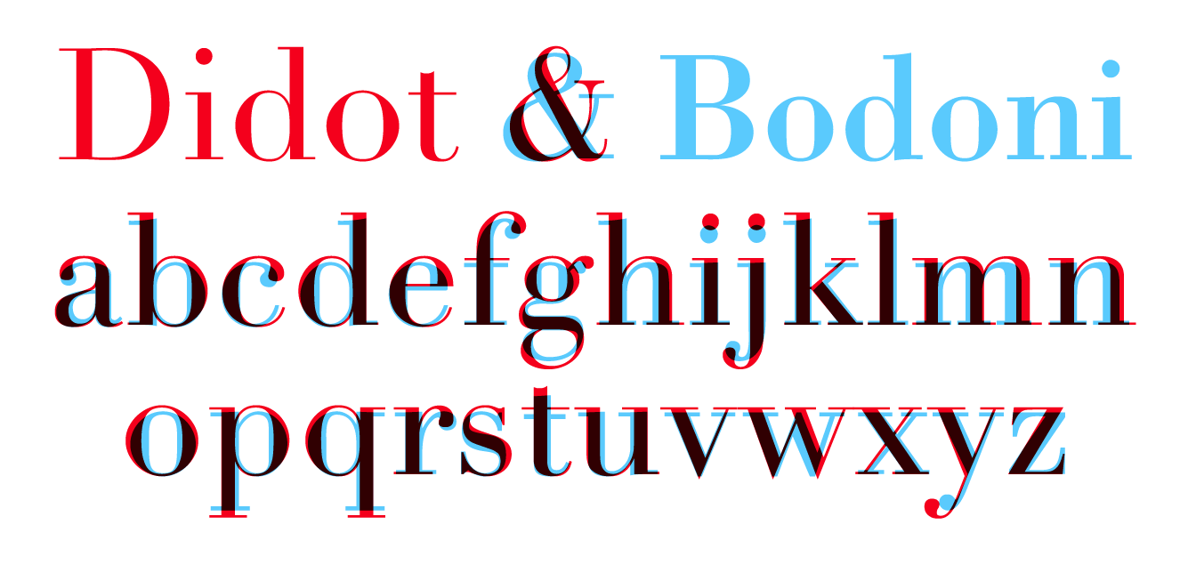
Honourable mentions include Jules who had no image, but raised his fist in defence. The underside of his forearm, etched in Nirvana lyrics, revealed the typeface Onyx that the band used for their album covers. The heartfelt ode was followed by Rachel, who revealed in an image the slight variations in the influential typefaces Didot and Bodoni. Overlaid, the disparities become obvious. For example the uppercase ‘J’ descends beyond the baseline and overall the Didot typeface has more of an air of elegance, effeminacy and refinement, aligning with its use on Vogue and Harper’s Bazaar covers for decades.