Green means go, and Red means stop. This universal colour scheme was first used by the railroad industry in 1830 and has since extended throughout our road networks, safety and emergency codes.
Originally white was used to indicate go, green to indicate caution, and red was used to indicate stop. In 1914 the white signal was replaced with green after a train running a stop signal collided with another train. The red lens cover had fallen out of its holder leaving the white light bulb exposed. The industry revised its codes to what we are familiar with today — Red for Stop, Green for Go and Orange for Caution, the standard now used throughout our transport system and beyond.

Red and Green signals are so integrated into our environment, and we are so reliant on them that we are on automatic pilot until emergency situations occur. However, designing a universal standard for use within safety and emergency signage is not as simple as it appears.

There has been a running debate for over 25 years, of America’s use of the Red Exit sign versus the ISO Standard green ‘Running Man’, (designed by Yukio Ota in the 1970’s) used in Europe and most other parts of the world.
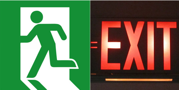
Defenders of the Green Running Man argue that the red exit sign is highly illogical as red indicates stop, alert, don’t touch, and this can cause stress and confusion, and people who do not speak the local language would find it difficult to use. The Green running man, on the other hand, uses a pictorial language that is accessible and universal, and its use of Green is calming and invites pedestrians to ‘go ahead’ or ‘keep on moving’.
Though as we have learnt to read architectural cues, knowing where to locate a sign within a building is equally important — for instance, is it at the end of a corridor? Is it near to a door? Is it danger red or safety green? Is it illuminated? Is the font bold or uppercase? The design of mandatory and traffic signage is a science that balances behavioural and environmental psychology with intuitive design.