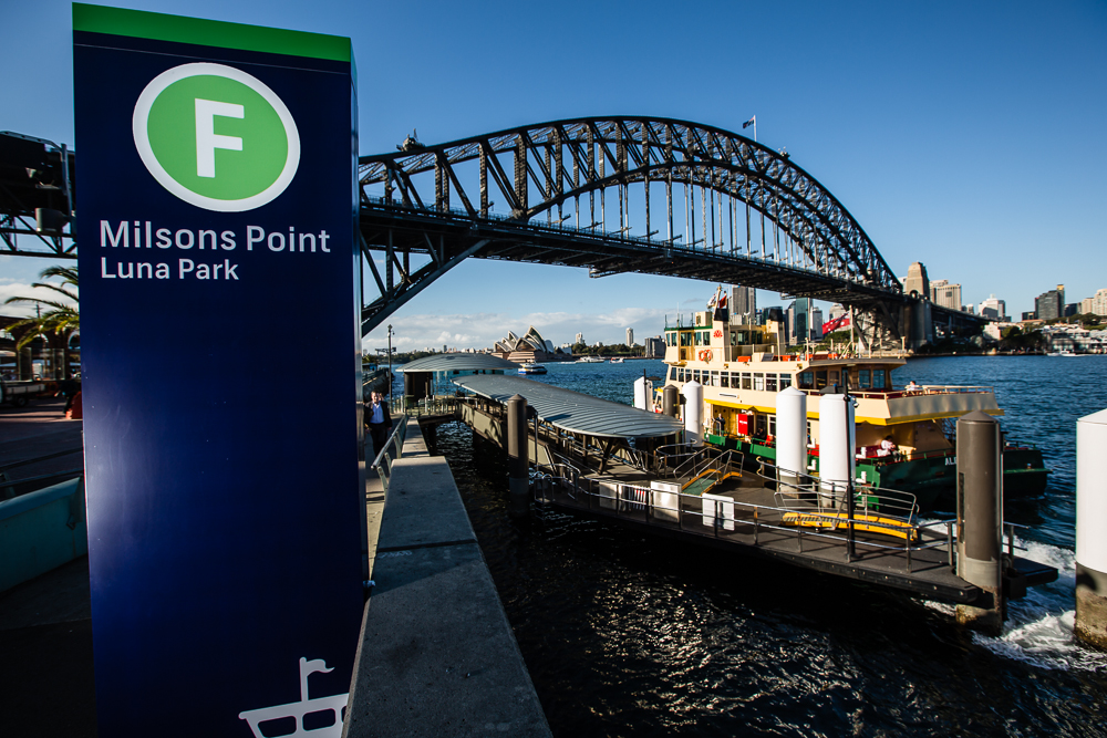
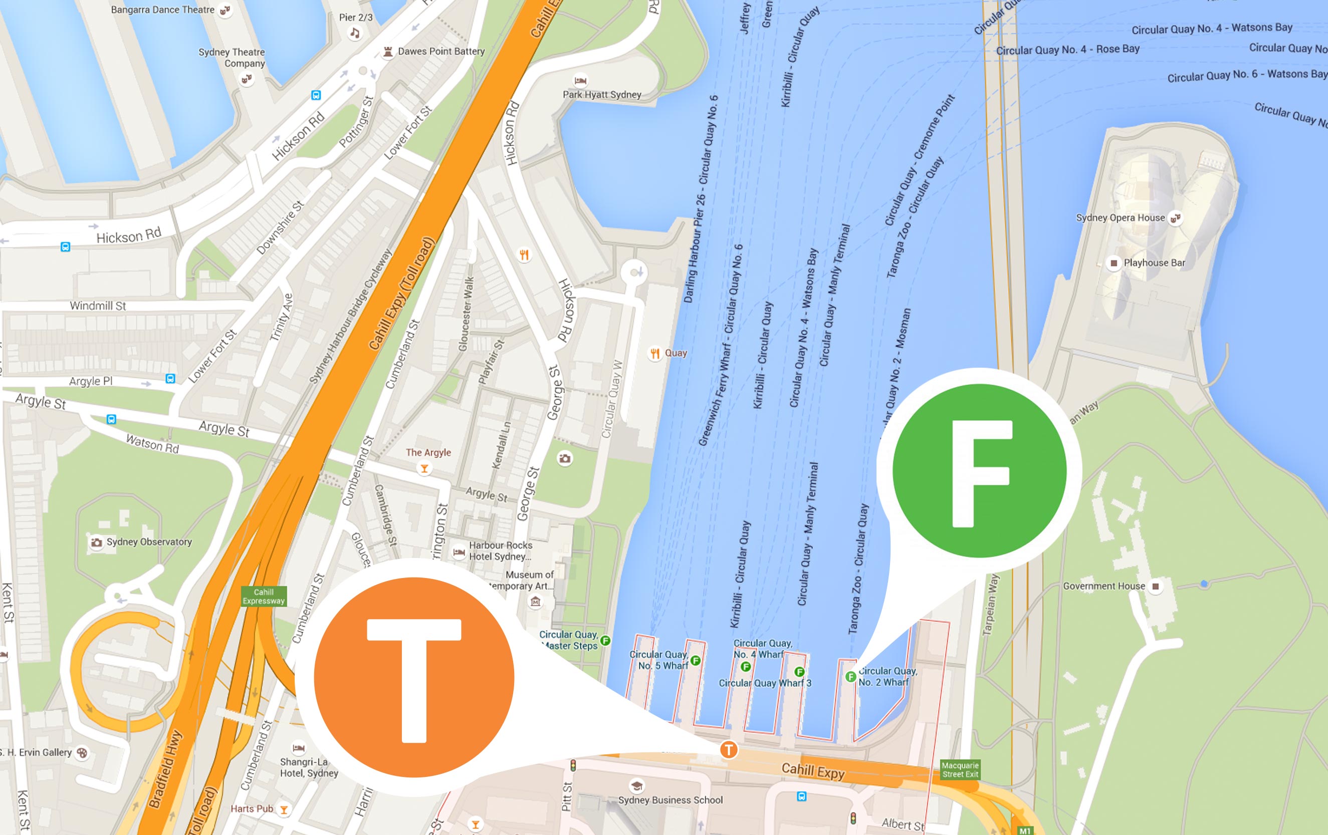
Recently “Google Maps” adopted the iconography from Transport for NSW (TfNSW) for the City of Sydney’s ferry, train and light rail services. Already in use in other global cities such as Paris (with the use of the official Metro icon) and London (London Underground and National Rail icons), Google’s design approach is consistent with the company’s belief in helping people “easily explore the world’s information.”
Consistent iconography has become increasingly relevant with the development of multi-platform technologies and the transition into digital wayfinding. How often have you used “Google Maps” to get from A to B? Icons are powerful symbols, which effectively and efficiently communicate information without overwhelming or distracting the user. If it looks good – even better!
Google’s change of graphics reflects an important aspect of design thinking and wayfinding: smoothing the transition from two-dimensional map viewing to the three-dimensional physical experience. Consistent use of symbols helps to simplify this transition and the user’s navigation through unfamiliar environments.
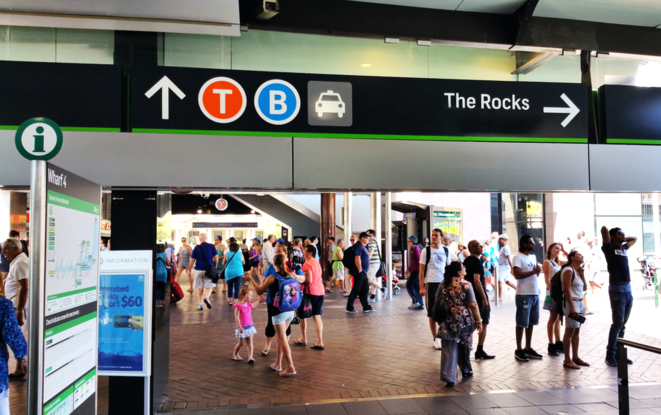
On a more subconscious, subtle level, the use of the new icons helps to extend Transport for NSW’s established brand colours into the digital wayfinding realm. This, in turn, helps to strengthen the Brand’s identity and recognition in a visually saturated world.
The adoption of this iconographic system heralds an even more connected and digital future, which BrandCulture is proud to be involved in.