 It’s becoming apparent that leading mobile apps are reinventing themselves as they strive to become more relevant, with the likes of Airbnb and Uber reviving their brands as of late. The most recent to jump on the bandwagon is the beloved Instagram, whose rebrand has caused quite a stir amongst fans, critics and designers over the last day.
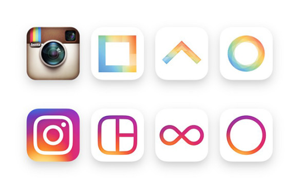
Instagram first debuted its skeuomorphic camera icon four years ago when all you could do was edit and share photos. The app has since evolved with Boomerangs, Hyperlapses and a new Explore function. With the introduction of these new features it becomes easy to understand why the company has decided to further develop their brand.
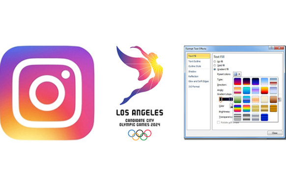
 I was initially struck by the colour, which transforms the iconic rainbow stripes of the original logo into a gradient reminiscent of my favourite Microsoft Powerpoint ‘fill’ in my earlier, more impressionable years. Instagram tried numerous minimal reinterpretations of the rainbow, however arrived at the gradient to portray the warmth and energy of its original counterpart. Interestingly enough, the recently revealed Los Angeles candidate city logo for the 2024 Olympic Games utilises the same gradient, taking inspiration from the sun and the colours of the California sky.
A battle between literality and history ensued as the company sought to design a simplified, scalable glyph that maintained its original character. In an article written by Instagram’s head of design, Ian Spalter states that “With this insight, we decided to translate these elements into a more modern app icon that strikes a balance between recognition and versatility”. Putting into practice the trend of abstracted, flat icons, the new brand mark has been pared down to single weighted white lines that merely suggest a camera. Their family of apps – Layout, Boomerang and Hyperlapse have also received a makeover, encapsulating the same elements as their parent logo.
A New Look for Instagram from Instagram on Vimeo.
The issue herein is memorability; it is now indistinguishable from the plethora of app icons that have also bought into the trend, proving difficult to identify on mobile interfaces. I revel in the thought process and layers of meaning behind an idea, however the logo feels to me to be a combination of graphic design’s most popular trends, despite the masses of conceptual talk behind the product – a case of convincibility over conviction.
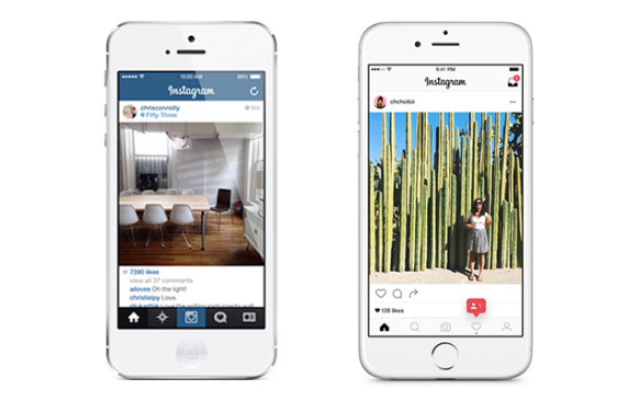
The rebrand also unveils a new user interface, endeavouring to keep posts as the focus of the app. A great move for Instagram, the blue has been stripped back, leaving an empty canvas of black and white for the user’s photos.
Spalter states that they didn’t want to make a change just for the “sake of novelty”, however the very thing they didn’t want to do to the logo seems to be exactly what they’ve achieved.
The brand mark, stripped down to its bones, fuels me with indifference as it submits itself to the trend of gradients, simple line work and flat design. The concept makes sense, however the overall aesthetic is obvious and uninspiring, when the iconic (no pun intended) Instagram was created to do just that – inspire.
With all this being said, I’ll get over this in a week or two and move onto dissecting bigger and brighter waters – Facebook rebrand, anyone?

