Yes we all do, thanks to some great designers who were able to create a global visual language capable of enabling the whole world to reach their favourite teams without having to know the specific language of the Olympic host nation. Who wouldn’t find it difficult to get to the fencing pavilion in a foreign country if all they had to rely on were verbal directions? We’d probably get a laughed at as we try to mime our way towards the location and never reach the place. Instead, we’d end up at a Kebab joint eating chicken skewers.
Thankfully, this situation is unlikely. Throughout the years pictograms have helped people finding their way without the use of words.?There are a few Olympic symbols which are particularly worthy of note.
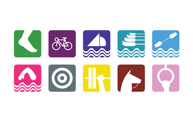
The first is well-known and came out of Mexico in 1968, when Lance Wyman created a pictogram system with a strong identity. Inspired by hippy culture and psychedelia, he developed a new set of pictograms representing all sports and facilities. The pictograms were symbolic, and the athletes were represented just partially. However the visual identity was very strong, and in line with the main concept.
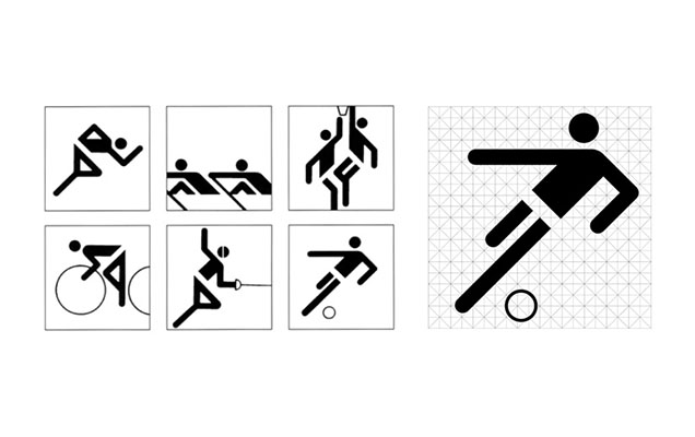
In Munich 1972, Otl Aicher designed one of the most elegant and functional pictograms based on a grid of horizontal, vertical and diagonal lines, which made the work a symbol of modernism and german efficiency. This is one of the best-known examples of pictogram design in the world, and has served as the foundation of many international standards.
The geometrical structure made by Otl Archer was reused in Montreal in 1968, and from 1980 Moscow, the pictogram sets slowly started to acquire an identity, which carried across to the Los Angeles 1984 Olympics and the Seoul Olympics in 1988. Every time, however, they were only a refreshed version of the original designs, never really developing further. But as time went by, the pictograms started to get some distance from Aicher’s rigorous geometry.
Still, the Olympics are just as much about national pride and promotion as they are comprehensibility, and pictograms started to become more dynamic in 1992 as the Barcelona Olympics marked Spain’s emergence as a modern European nation.
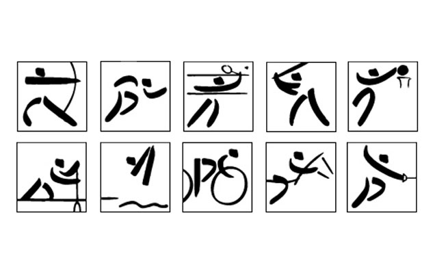
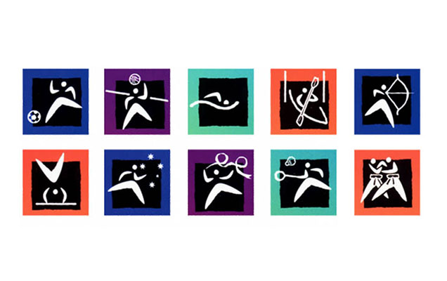
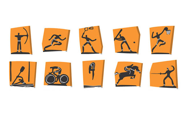
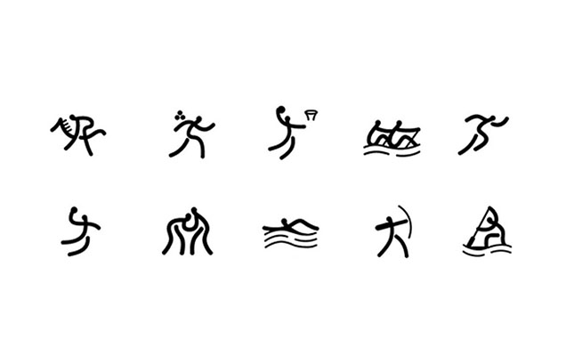
But where is the cultural spirit of the host nation? After the Munich games, it seemed to disappear for a long time until the year 2000 at the Sydney Olympic Games, where the boomerang was integrated as a national symbol and became a strong local connotation recognisable worldwide. Later on, in 2004, Greece also decided to represent their national culture by taking inspiration from ancient Greek vases. Likewise, the pictograms designed for Beijing 2008 were called “The Beauty of Seal Characters” and were inspired by the ancient Jigwen symbols. The result was an original modern combination of culture and beauty.
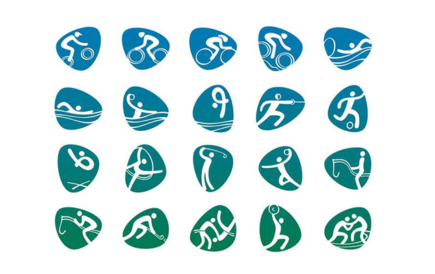
The pictograms designed for the Rio games were recently released, what do you think?
