Pictograms play a vital role in wayfinding – but how are they evolving in the digital age? This week, we showcase some of the world’s newest pictograms and ask which ones are destined to become universal.
The world’s earliest pictograms appeared as prehistoric rock paintings, but today’s pictograms are a modern phenomenon. It wasn’t until the 1930s that they began to be used extensively in London railway timetables. The International Olympic Committee began designing bespoke pictograms for each of its Games in 1964. And in the 1970s, the International Organisation for Standardization released ISO 7001 – a catalogue of universal public information symbols.
Today, wayfinding designers use pictograms to represent objects visually, transcending words, languages, locations and cultures. The beauty of symbols is they say a lot with very little. As SEGD explains: “Symbols can often communicate information more concisely than words.”
But all languages evolve, including visual ones. It’s time to consider a new breed of pictograms, designed to reflect a more complex world.
From physical signage to Twitter birds
There are a few trends driving the creation of pictograms. Let’s start with the proliferation of icons designed for the digital age. With an icon for every app and an emoji for every emotion, we’ve entered an era of pictograph-based communication. Just think how recognisable the Twitter bird is, or YouTube’s play button. Interestingly, some icons are based on analogue technology, like the WhatsApp old-school telephone. These icons are easily recognised today. But will they need to be phased out as younger generations grow up and new technology is invented?
The rise of smart technologies is also inspiring a suite of pictograms that address privacy concerns. In Toronto, Sidewalk Labs has just introduced a “visual language” to let people know when and how technology is being used to track or monitor them (pictured bottom left, below). Each sign will highlight otherwise-invisible technology, which Sidewalk Labs plans to use in a ‘smart’ neighbourhood called Quayside.
It’s a good example of how our wayfinding lexicon is constantly evolving. Does Australia need its own symbols to alert people when their data is being collected in public spaces?
All-gender wayfinding pictograms
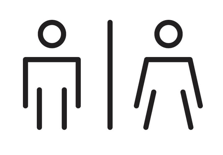
Not only is the world is more complex, digitised and more visually aware, but it’s also more thoughtful when it comes to gender, accessibility and inclusivity. Sometimes, this means rethinking pictograms from scratch.
A good example is Sargood on Collaroy – Australia’s first health and wellness resort for people with permanent damage to their spinal cord. We realised that amenity pictograms typically depict people from head to toe. So, to better represent Sargood’s guests, we designed bespoke pictograms that incorporate the treads of a wheelchair and enhance inclusion (pictured top left, below).
We also loved the University of Technology Sydney’s decision to roll out “all-gender” bathrooms in support of gender diversity. These signs can now be found across nine UTS buildings and feature a pictogram that combines male and female icons as one. As UTS explained: “Some people within our community don’t identify with traditional binary genders (male and female) … All gender bathrooms provide a space that can be used comfortably by everyone.”
Things to consider when designing pictograms
Should you use an existing set of pictograms? Or design a new set from scratch? To help you decide, here are a few tips.
Customised pictograms are a great way to inject personality into a brand. They can make brands more recognisable and give them a personality. A pictogram can appear playful, trustworthy, friendly, or contain cultural cues that give people a sense of where your brand is from and what it represents.
Universal pictograms are perfect when information needs to be understood really quickly by a wide audience. Think of safety signs, traffic signs and exit signs. These signs are universally recognised and easily understood by people across cultures.
If you are thinking of redesigning universal pictograms to suit your brand, remember that overly customised or ornate symbols can take longer for a new viewer to understand at a glance. A good set of pictograms should have the same level of detail across all symbols. A limited colour palette and consistent design style should be used to create a cohesive set of pictograms.
If in doubt, it’s a good idea to ask a wayfinding design studio to help you choose pictograms that comply with the Australian Wayfinding Standards. The Society for Experiential Graphic Design has a library of symbols, available here.
The Noun Project also offers “icons for everything” and hosts ‘Iconathons’ where designers get together to create more equal and civic-minded symbols for the public domain. Its most recent Iconathon brought together designers in New York to create more equal representations of women in design and creative leadership positions. It’s an excellent place to keep an eye on emerging icons – some of which may one day become universally recognised.