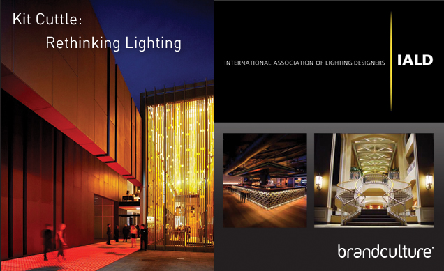
Gordon Eckel and Stephen Minning went along to the Kit Cuttle talk (RETHINKING LIGHTING) at the Australian Institute of Architects.

How do humans really perceive light and spaces? Kit Cuttle proposes a fundamental rethink of how lighting should be assessed and designed so human response, visual
clarity and assimilation with architecture are considered to ensure the lighting is elegant, visually effective, energy efficient and actually enhances the experience.
Kit proposes a new measurement of ambient light PAI (Perceived Adequacy of illuminesance) where light would no longer measured at desk height (horizontal work plane) but at a persons eye level with reflected light from the surrounding surfaces and objects in a room. Thus the environment would play an essential part in creating the lighting required for different situations such as reading, walking, eating and meetings, not all need high levels of light.
Apparently in 1911 a lighting report published in a handbook by the London Illumination Society noted required lighting levels at a fraction of what are current standards today.
A couple of years ago BrandCulture were engaged by xyznetworks (Foxtel) to work on the new offices in North Ryde. The staff had moved from a ‘warehouse’ style of office with considerably less lighting and were generally aggravated and complained about th lighting in the new office, to the extent of taking out the lights themselves to reduce the overall glare in the office. Most of the surfaces were white; desks, walls, powerblades, pillars etc… needless to say there was an issue that needed to be addressed in order to make the occupants feel comfortable in their work place.
BrandCulture devised a solution (working with lighting engineers) where walls and columns were painted matt black, in the instances of the building columns blackboard paint was used so the staff could use these surfaces. The end walls in each work space had key focal environmental graphics installed using an updatable frame system in conjunction with wall wash lighting. The powerblades were also wrapped with up-dateable environmental graphics and small down lights were added again to focus on these areas to create a more dramatic effect in the space.
There was little budget to change the ceiling grid lighting system so we devised an innovative solution of printing to opal acrylic panels (using the brand graphic in B&W so as not to affect colour) in order to reduce lighting levels without changing the light fittings completely. The end result was a more content workforce and a branded environment the company felt was a true reflection (no pun intended!) of what they did.

These projects above were referenced by Kit Cuttle in his presentation; Kerry Hills Architects created a cleverly layered series of interlocked spaces over several levels when they designed the The State Theatre of Western Australia, lighting design by Electrolight. The lighting is an integrated element of the architecture which helps to create a distinctive daytime and night time appearance that delineates both the function and the form of the various spaces. The overall design concept for the lighting to the State Theatre of WA seeks to metaphorically support the activity of making of theatre, a craft that informs explicitly and subtly the way we think about the world. The lighting always seeks to impart a sense of drama and possibility in its application and appearance. Light leads the visitor on a journey through the space that resolves around the dedicated illumination of specific elements and functional requirements. We have not designed for blanket uniformity but rather a quality of light which provides strength of focus and contrast. Light accentuates material selections, reveals textures and supports the fabrics palette. Luminaires that are not concealed have been deliberately positioned to create unexpected arrangements on the ceiling surfaces that encourage a renewed sense of character for the space.
