
There has been a lot of controversy in the past couple of weeks over UBER’s recent re-design. Once viewed on smartphones as a bold, recognisable black-and-white ‘U’, it has now been replaced with an oddly shaped hexagon, resembling an “installing app” icon.
The app opens with a patterned animation, welcoming users to the new Uber, yet alters its colour palette from country to country.
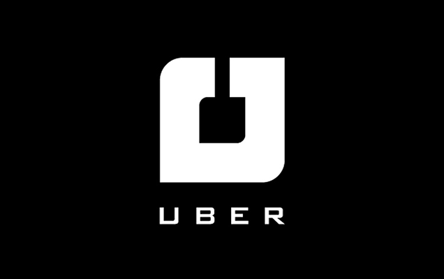
The logo has been mocked as meaningless and poorly executed, however it has certainly generated a lot of press – so much so that a competition was established, inviting designers to submit their best re-design of the logo. The winner’s simple solution was to turn the re-designed brandmark around 90 degrees so that it resembled a ‘U’.
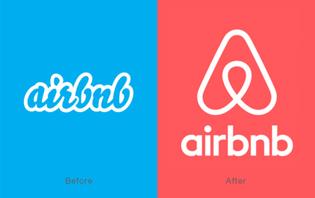
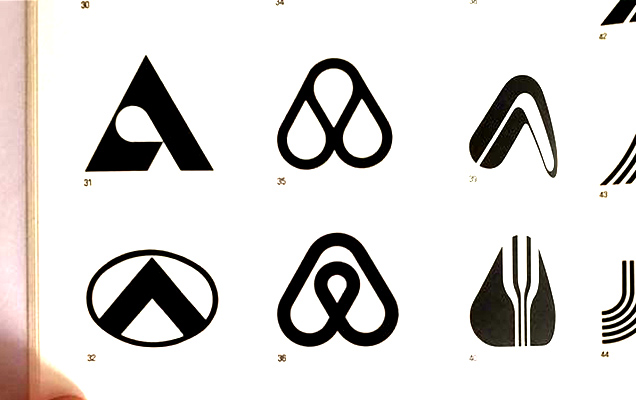
This faux pas resembled the same misfortune Airbnb experienced last year when it launched its new and improved Belo logo. Not only was it accused of resembling a certain part of the female anatomy, but also an uncanny likeliness to the already established Automation Anywhere logo. There was also some controversy over where the Airbnb logo originated with some claiming it was from a book illustrating the various adaptions of the letter ‘A’.
Despite this coincidence, it does demonstrate how even months of design can produce results that have already been seen before.
So the real question is: Is it a case of bad design or clever marketing leading to brand awareness? U decide!